If you have been on the web at all in the last couple of years, you have certainly seen material design in the wild, be that in Android apps or, increasingly, in web design. Material design can be strikingly beautiful and yet almost imperceptible. It makes for a polished look and keeps website visitors engaged and entertained.
Would you like to apply the clean, modern look and high usability of this design style to your WordPress website? This article shows how you can do a material design makeover with nothing but Google’s material design style guide, CSS Hero plugin and a good measure of inspiration. CSS Hero has many tools to make this DIY project happen without you breaking a sweat or churning out a bunch of code.
A short primer on material design: It is inspired by classic print design principles and uses elements such as typography, grids, space, scale, color, and imagery to create hierarchy, meaning, and focus that immerse the user in the experience.
Material design is a minimalist style, so prepare to exercise your moderation muscles when it comes to the number of colors and effects like shadows and motion. The minimum effective dose will be just right.
Material design is in some ways similar to its predecessor, flat design. The main difference between the two is depth, as material design uses lights and shadows to create a highly abstract version of the real-world experience. However, the key here is subtlety – you won’t see exaggerated 3D effects, realistic textures or highlights in good examples of material design.
Now, let’s dig into the main principles of material design and how you can implement them on your website using CSS Hero.
Use shadows to create tangible surfaces and convey hierarchy of elements
To quote one of the principles of material design as outlined by Google,
The fundamentals of light, surface, and movement are key to conveying how objects move, interact, and exist in space and in relation to each other.
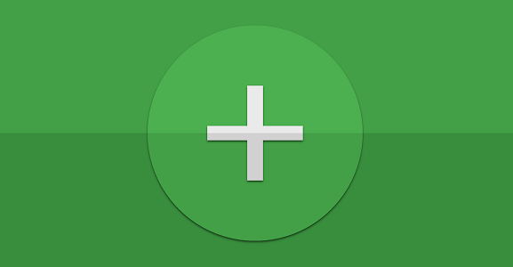
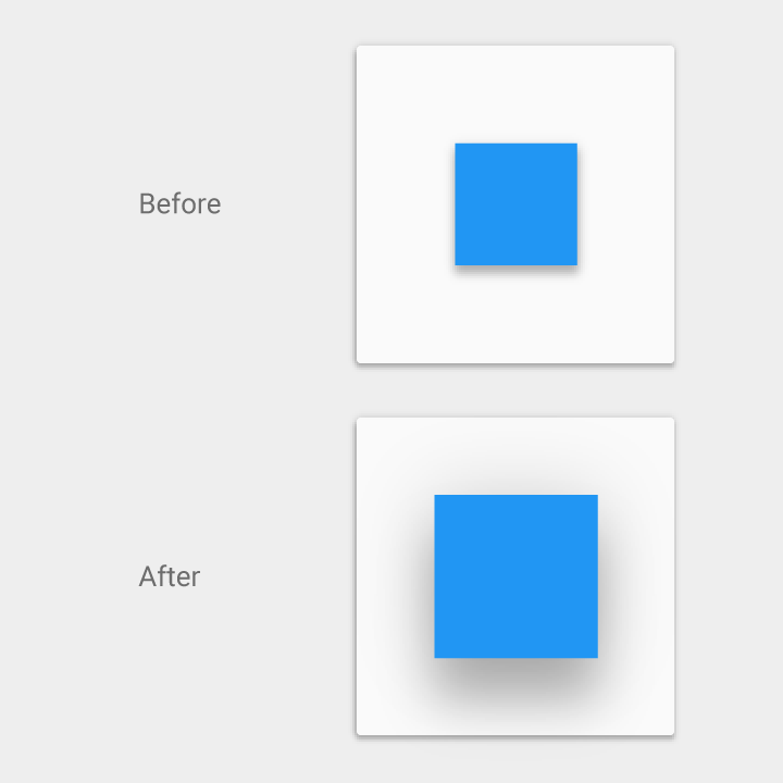
On this image from Google’s style guide, softer, larger shadows indicate the floating action button is at a higher elevation than the blue sheet, which has a crisper shadow.
The first step to making your website look material is to add depth by using surfaces, edges, and realistic shadows and lighting. Use this section of Google’s style guide to work out the elevation of the different elements and what casts a shadow on what, and then add shadows accordingly.
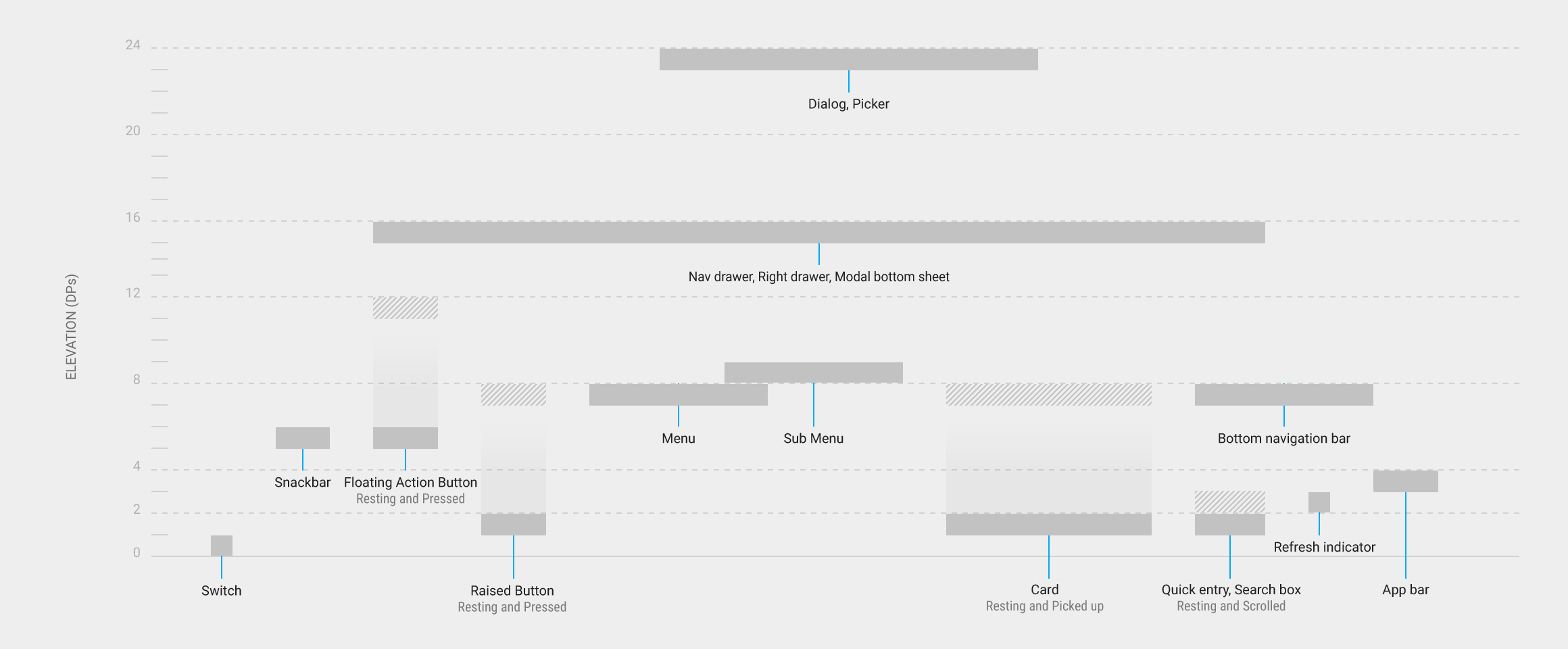
Component elevation comparison chart from Google
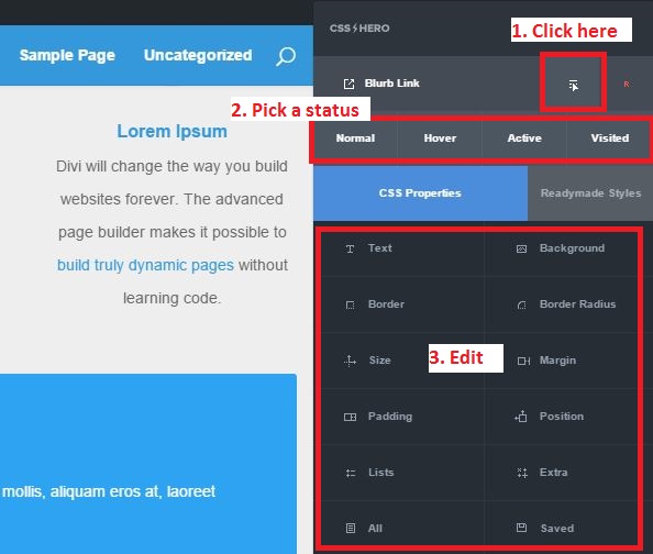
How to achieve subtle shadow effects with CSS Hero (coding-free!)
- Select the object that is elevated above the background surface or its parent element. In our case, it’s the blue “Find out more” button.
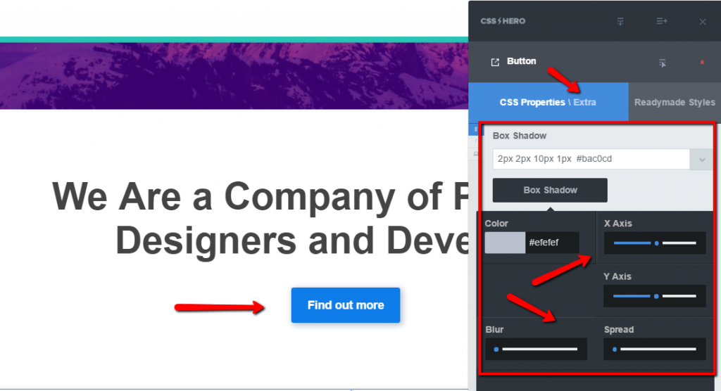
Creating a button shadow with CSS Hero
- From CSS Hero Properties Panel, click on Extra properties. Box Shadow settings will be right on top. In the example above, we set a box-shadow to: 2px 2px 10px 1px #bac0cd. These numbers are the settings for horizontal offset, vertical offset, blur radius, spread radius, and color respectively. You can use the toggles and the color picker for the settings, or just enter the values manually.
- In case of multiple elevated elements, work with the Blur and Spread settings to create the effect of higher/lower elevation. Smaller Blur and Spread will create a tighter shadow, suitable for items that are supposed to be closer to the background.

Bonus tip: For a shortcut, apply one of the Readymade styles to the button: Readymade styles – Buttons – Material. Then, you can further tweak Color, Box Shadow, Border Radius or other properties so the button is a perfect fit for your design needs.
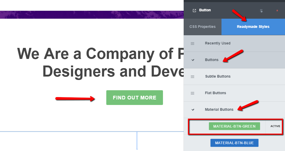
Leverage Readymade Styles to quickly apply material style to the button
Design realistic and intuitive animations
Motion is meaningful and appropriate, serving to focus attention and maintain continuity. Feedback is subtle yet clear. Transitions are efficient yet coherent.
Meaningful motion is one of the key characteristics of material design. Animations should either guide users’ actions, be initiated by them, or provide feedback. Include animation in the UI elements users interact with the most, like navigation menus, call to action buttons or subscription forms. Movement is eye-catching and serves as a way to manage users’ attention and draw it to the most important objects on the page.
With material design, you want the animations to mimic the motions of real life – items getting bigger as you get closer and interact with them. Just like in real world, where changes don’t happen instantaneously, you want to give a little bit of time to your transitions – but not so much that they make the interactions annoyingly sluggish.
By the way, many modern themes, such as Zephyr, Divi, Material and MaterialWP, adopt various principles of Google’s material design philosophy and include subtle animations, transitions, and parallax effects “out of the box,” so if you want theme-wide material design overhaul, there are many options out there. Naturally, once you settle on a material theme, you can customize the colors and add even more material design effects with CSS Hero.
Creating meaningful animations with CSS Hero
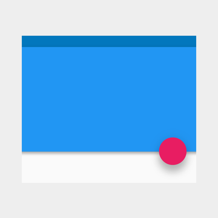
On this example from Google, the shadow grows softer and larger as the object’s elevation increases and becomes crisper and smaller as the elevation decreases.
Elevation and shadow animation in material design
You can easily replicate this scale and shadow animation with CSS Hero – even if you have zero coding skills. In this effect, the image or other object moves outside of the boundaries of the element. Because of that, you need to make sure that your elements are not too close to each other, so they do not overlap when one of them is hovered over.
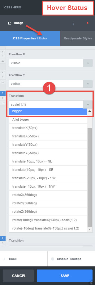
Here’s how to access the Status Editor tool you’ll need for this animation:
CSS Hero Status Editor Tool
3 steps to creating a scale and shadow animation with CSS Hero:
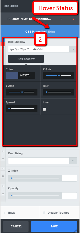
- Hover status. Extra properties. Set Transform property to bigger (1.1).
- Hover status. Extra properties. Click on the Box Shadow button and increase the Blur and Spread to create the elevation effect.
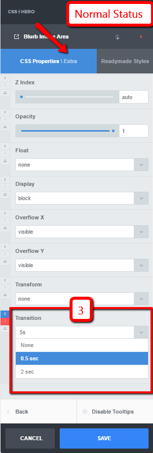
- Normal status. Extra properties. Add a transition (0.5s is ok) to smooth the effect. Save your changes.
Scale and shadow animation – step 1
Scale and shadow animation – step 2
Scale and shadow animation – step 3
For more examples of website animations you can create in minutes with CSS Hero, check out our recent tutorial on hover effects. The article uses images as examples, but you can apply the same tools and principles to navigation menus, content cards, buttons, and pretty much anything you’d like to animate on hover. For example, the Image Zoom hover described in that article can be used to animate a full-width background image for a subtle and yet enticing effect.
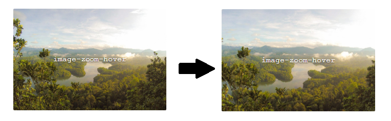
The image zooms in slightly on hover – create this effect with CSS Hero.
By the way, in the future, it will be even easier to add CSS3 animations with CSS Hero. We are conjuring an Animator extension for CSS Hero – see the short teaser video below. The release date is still to be determined, but we have a feeling you will love this point-and-click animator, so stay tuned.
Go for bold colors
While animations and shadows are kept subtle in material design, when it comes to colors, it’s time to be bold, graphic, and intentional. Bright, intense colors make things fun and serve as one of the main ways to express your brand’s personality.
Since material design doesn’t employ that many design elements, it’s essential that you are able to change the color of the different sections of your website. CSS Hero helps you do exactly that, in real time and without having to write code.
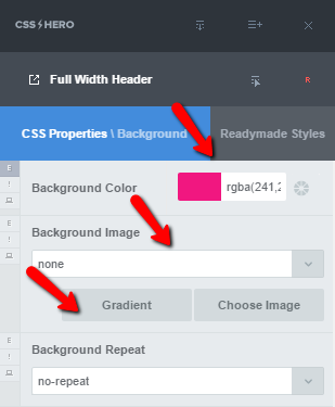
When you target a section with CSS Hero’s selector tool and choose Background from the Properties menu, you have options to set colors, or choose an image or a gradient for that section. You can even change the Background Blend Mode for fancy Photoshop-like effects.
Easily pick and set bold background colors with CSS Hero
By the way, to make it easier for you, CSS Hero’s color picker “remembers” the colors you have already used, so once you settle on a palette, it will be a breeze to apply the same colors to other elements on your site.
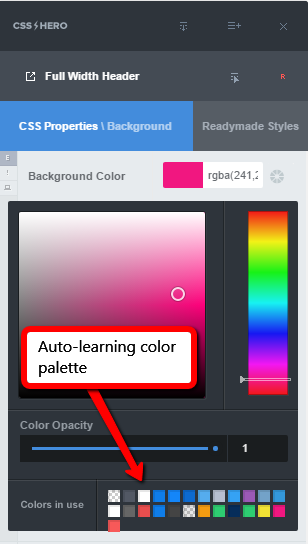
Auto-learning color palette in CSS Hero
Bold colors do not mean rainbow-colored website. As easy as it is to get carried away with CSS Hero’s styling options, do exercise moderation and stick to three main colors and one accent color. If you are not entirely sure how to pick a color scheme, Material Design Blog lists some tools for creating material design color palettes.
Revel in large-scale typography
The original material design takes an extremely minimalist approach to fonts and recommends using a single font, Roboto, in different weights, styles and sizes to convey the hierarchy of content. Considering that Material design was originally developed to unify the styles of various Android apps and other Google products, that makes sense. However, after its release in 2014, material design has taken on a life of its own, so, on your site, it is totally appropriate to swap Roboto for something else if you wish.
Just remember, we are still dealing with minimalist design, so it’s a good idea to limit yourself to two, maximum three, fonts and instead use font sizes and styles to define the structure of content on your website. Google’s typographic scale (below) provides a nice example of type sizes and styles that work well together and won’t wreck your layout.
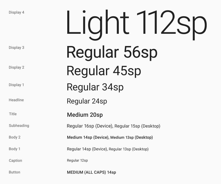
Material design typographic scale
Use large-scale typography for main display areas, but be sure to give it enough white space.
CSS Hero comes with a wide selection of Google fonts, including Roboto, so you can simply target an element, go to the Text properties and style it in a certain typeface, weight, size, and color. To continue from the previous point, you can use font color to create even more striking effects.
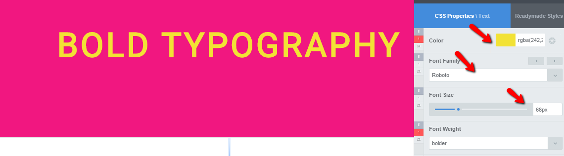
Style fonts and colors with CSS Hero to create bold typography effects
If Google fonts aren’t your cup of tea, you can easily add other custom fonts to your site and then use them with CSS Hero.
Tell your story with edge-to-edge images
Target the image container, head to Size, and set the width to 100%. Typically, this will do the trick; however, you could also use viewport units – relative units that express the size of an element as a percentage of a viewport size, or the area of the screen used to display information. Viewport units are especially useful for setting full-width, full-height images (read more about viewport units here).
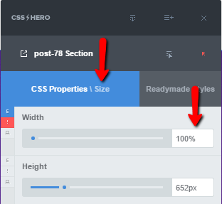
Create an edge-to-edge image with CSS Hero
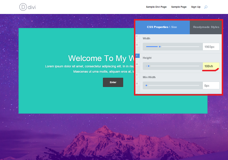
Set the height to 100vh (viewport units) to create a full-height image
Fine-tune the adaptive design
Lastly and unsurprisingly, material design is all about “a unified experience across platforms and device sizes.” In a nutshell, you want your colors, iconography, hierarchy and even layout to remain consistent, so your website visitors don’t get confused if they switch from one device to another.
Most modern frameworks and themes come with a responsive layout, so the content grid conveniently flows from one medium to another. And for smaller-scale responsive changes, not related to the layout per se, you can use CSS Hero. Its tools like the Responsive Editor and “Desktop Only” switch will help you edit typography, buttons, and animations so they are bold and large on big screens and yet still fit mobile devices.
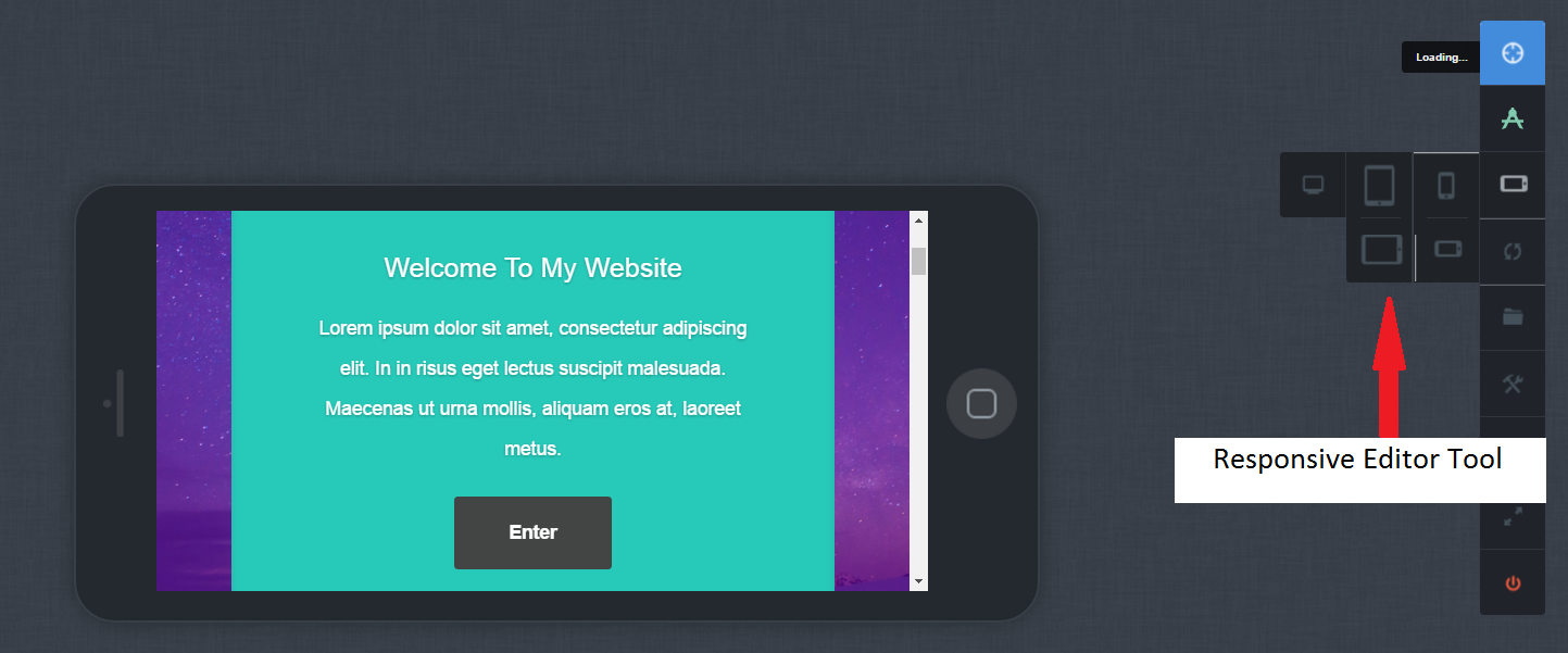
CSS Hero Responsive Editor
Just like any web design trend, material design probably won’t satisfy all of your needs and aspirations. Even more, you don’t have to follow Google’s style guide to a tee. (Otherwise, all material design websites would look the same). Get creative and mix and match, depending on which techniques work best for your project. Finally, draw inspiration from those who do material design well, and then use CSS Hero to recreate the look and feel on your own website.
Over to you: Are you a fan of material design? Have you implemented any of its principles on your website? Tell us in the comments!
P.S. If you have friends who love to get creative and tweak their WordPress theme from time to time, consider sharing this article with them – we’d appreciate it.