
Since we started our journey working on the very first CSS Hero alpha version we never stopped developing and going further to make our plugin more powerful and smart while keeping it easy to use both for the skilled developer and for the first time user. Today we’re adding another milestone to our development process as i’m really glad to introduce you our latest CSS Hero upgrade which, among the other upgrades, adds full support for landscape oriented mobile and tablet devices.
Landscape Mode
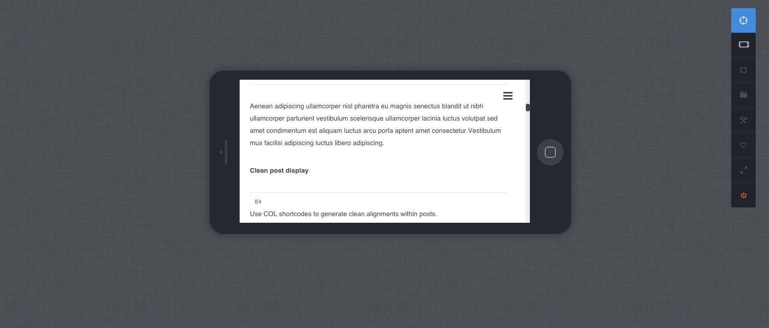
CSS Hero editing in Mobile Landscape mode
CSS Hero’s device mode has been one of the most loved features of our plugin, for those unfamiliar with it it basically allows you to visually provide custom responsive edits both for mobile and tablets instead of having to deal with media queries. Now with 1.3 you can switch orientation and apply some edits to portrait or landscape modes with just a couple of clicks.
Enhancing responsive edits with hierarchy
CSS Hero’s responsive edits are now managed hierarchically by automatically extending each edit to lower sized devices, this means that if you apply a css rule on the tablet landscape mode it will be inherited by all other devices (except Desktop of course). If you still want that edit to be different on (let’s say) mobile landscape you can still re-customize it on that specific device mode.
Desktop > Landscape Tablet > Portrait Tablet > Landscape Mobile > Portrait Mobile
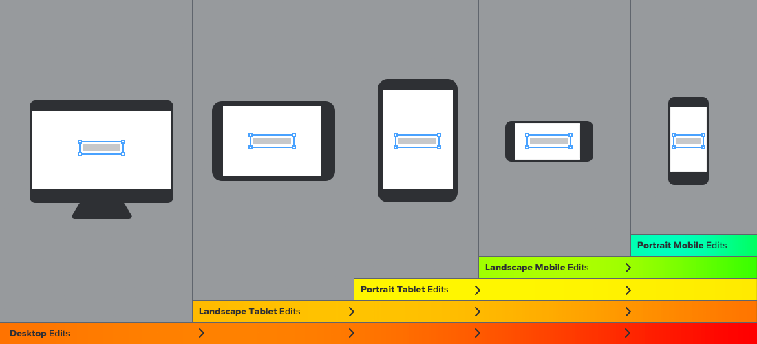
CSS Hero Responsive Inheritance schema
However, in some cases you may still want to apply a modification only on the Desktop version while keeping the default style available on devices, since Hero 1.3 you can now easily do this:
Applying an edit ONLY on large screens: desktop-only edits
Sometimes you may need to apply an edit on your site ONLY when being rendered on large screens, usually more than 1024px wide. The typical example is changing a font size on desktop mode while keeping the default font-size readability on devices. Now with Hero 1.3 you can provide Desktop specific edits by simply hitting the Apply only to large screens toggle in your CSS Hero interface:
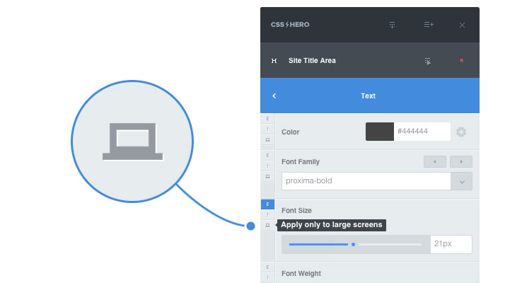
Applying an edit only on desktop mode
By clicking it that specific edit will not apply to all views as it would do normally but will only apply to Desktop mode.
If you’re a long time user of our Plugin you’ve surely noticed that something has changed on the left side of the editor as we’ve re-arranged the edit toolset to the left side of the property box. For those unfamiliar with this useful options here’s a brief description of each of them:
- The Edited flag [E]
This element highlights when the current property has been edited, if a re-edit occurs it provides the latest available edit value in case you need to go back - The !Important toggle [!]
If clicked it adds an !important statement to the current edit. Extremely useful when an edit isn’t applying due to the original theme CSS being applied inline or has been applied with a previously set !important statement.
Inspector supported
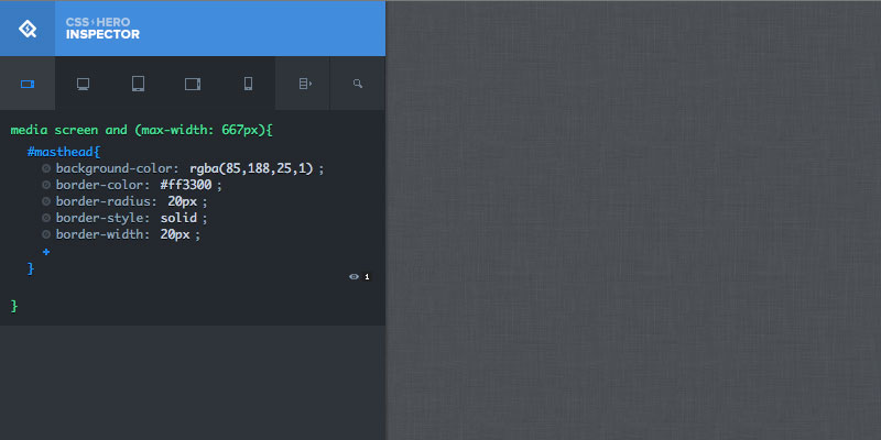
CSS Hero Inspector previewing Mobile Landscape oriented edits
Of course Inspector has been updated too in order to support the new break points available in CSS Hero 1.3 bringing you an extra control layer on your CSS Hero edits with live code editing.
That’s all folks, CSS Hero 1.3 is available in your Dashboards if you’re already a CSS Hero user, if you’re not go get it now and boost your creativity with the easiest way to customize WordPress Themes, live!