Do you think that dynamic image hover effects are complicated and expensive? Fortunately, you are wrong. Today, we have a special treat for you: A tutorial on creating image mouse over effects without a single line of code! If before now you have been using CSS Hero only to change fonts and colors on your website, it’s time to step into your superpowers. Creating these advanced, designer-worthy image hover effects is a breeze with CSS Hero. Four or five steps and you have a beautiful effect enriching your user experience.
Image hover effects create interesting microinteractions on your website and captivate your visitor. Microinteractions, or subtle movements of elements on a website, are a significant trend in web design. Microinteractions evoke attention, increase user engagement and make for smooth storytelling. And to be completely honest, they also make your website look cool. They are totally worth spending a few minutes on.
A couple of things before we dive into the tutorial. The steps need to be done in the order they are listed, so you will have to shift between Normal and Hover statuses of images a couple of times. Below is the screenshot showing how to switch between editing different statuses.
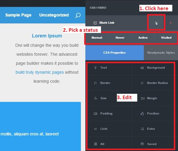
CSS Hero Status Editor Tool
In this way, you can also modify hover effects for links, backgrounds, buttons and more, but in this blog post, we focus specifically on image hover effects.
So you have launched CSS Hero and targeted a website section or an element, such as a blurb or image. Now, let’s have some fun and add some movement and spice to it – in just a few easy-to-follow steps.
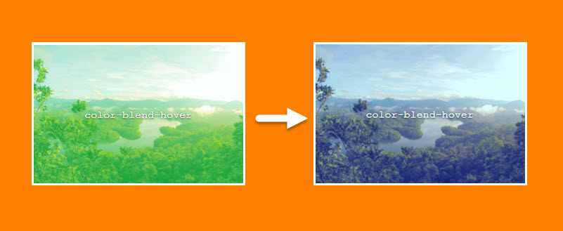
Color blend hover
Color blend effects use two layers of visuals and can create stunning imagery by combining the pixels laid on top of each other in different ways. Photoshop made color blend modes universally familiar. However, you don’t need Photoshop to add color blend effects to your website images – you can achieve the same result with CSS. The obvious benefit is that CSS allows to evoke the blend effect on hover, creating not only a visually stunning but also dynamic effect.
CSS Hero lets you have fun with 15 different color blend modes. You can read more about these modes and see examples on Photoshop website.
Here are the steps to creating a beautiful color blend hover effect:
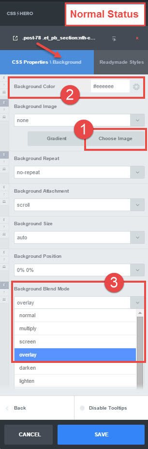
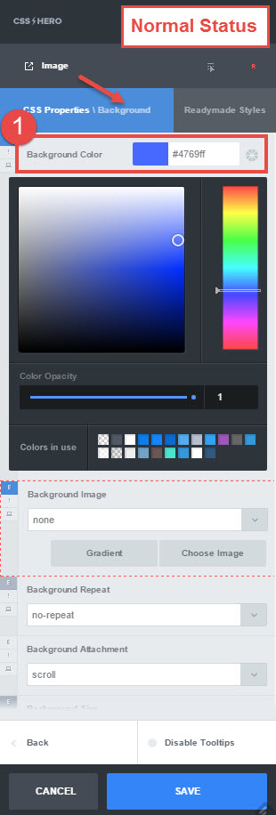
- Normal status. Background property. Upload a new photo or choose one from your media library and set a background-image. (optionally, set background-size to cover)
- Normal status. Choose a background-color.
- Normal status. Choose background-blend-mode. For the example, we used overlay, but you might have to find your own to reach a nice color\image combo.
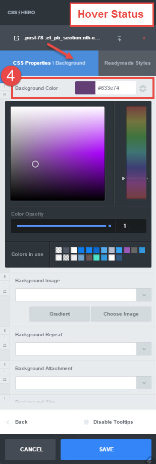
- Hover status. Background property. Set a different background-color and check that the color\image combination is ok.
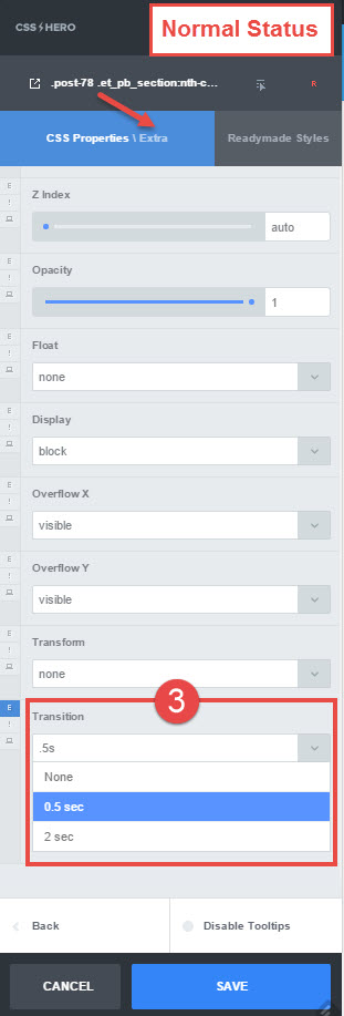
- Normal status. Extra properties. Add a transition (0.5s is ok) to smooth the effect.
Color blend hover – steps 1-3
Color blend hover – step 4

Color blend hover- step 5
Image zoom hover
With this effect, when the user hovers over the image, the photo will enlarge while staying within the boundaries of the section or element. This creates a captivating, smooth zoom in effect. Image zoom hover pulls the visitor in and looks fantastic with panoramic pictures, food photos, and even with your team’s headshots. Almost any image with some detail would benefit from a subtle zoom in, so you’ll have to experiment with it. That’s where all the fun is, right?
On to the steps:
- Normal status. Background property. Upload or choose a photo and set a background-image.
- Normal status. Set background-size to 100% 100%.
- Normal status. Set background-position to center center.
- Hover status. Background property. Set a different background-size – 120% 120% for example. You will need to enter these values manually as the exact percentages will not be available from the background-size drop-down menu.
- Normal status. Extra properties. Add a transition (0.5s is ok) to smooth the effect.
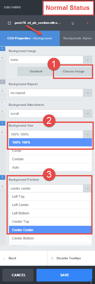
Image zoom hover – steps 1-3
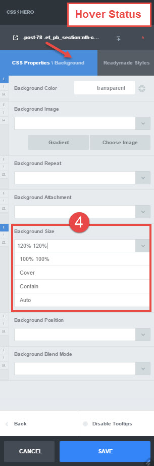
Image zoom hover – step 4

Image zoom hover- step 5
Inner shadow hover
In the featured example, this hover effect gives dimension to the flat red color. It can be a nice effect to use on a homepage, for example, where you have several columns side-by-side and want to emphasize the movement of the mouse from one column to another.
When applied to photos, inner shadow effect creates a nice vignette. Of course, you can reverse this effect and have the vignette on photos in the normal state and then make them bright and clear when a user hovers over them. That’s the beauty of all these effects – once you realize how easy they are to design, the floodgate to your creativity opens, and you discover truly artistic combinations.
Steps to the inner shadow hover effect:
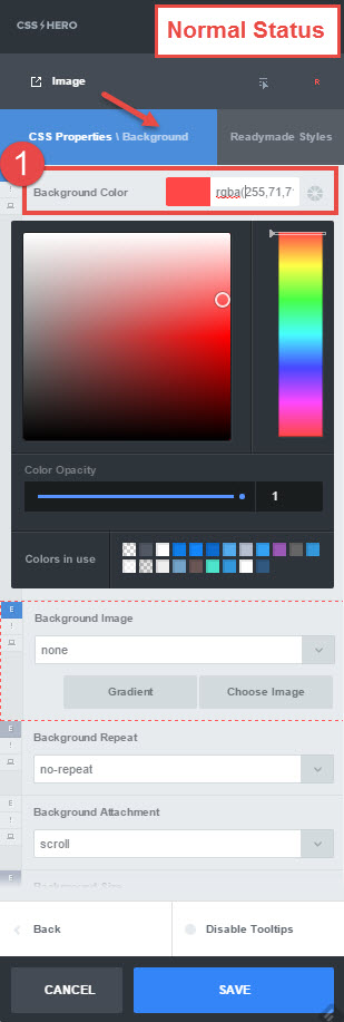
- Normal status. Background property. Set a background-color. We used rgba(255,71,71,1) for this example (hex code #ff4747). You can copy and paste the values, or pick a color with the color picker tool.
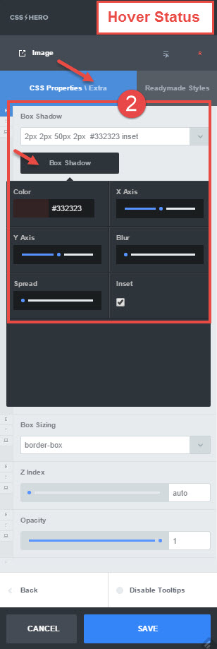
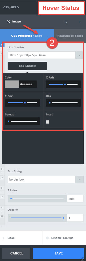
- Hover status. Extra properties. Set a box-shadow to something like: 2px 2px 50px 2px #332323 inset. These numbers are the settings for horizontal offset, vertical offset, blur radius, spread radius, and color respectively. You can pull on the toggles and see the box-shadow change live, or, if you like the shadow in our example, you can enter the values manually. The box-shadow drop-down list is pre-populated with some common box-shadow settings, but for this example, we used the black Box Shadow button below the list to create custom settings.
- Normal status. Extra properties. Add a transition (0.5s is ok) to smooth the effect.
Inner shadow hover- step 1
Inner shadow hover- step 2

Inner shadow effect – step 3
Outer shadow hover
Outer shadow effect creates an illusion of volume, space between the element and its background. As a hover effect, outer shadow draws user’s attention to a particular image or element on the page. This is especially helpful when the page has several or many elements, for example in a gallery or grid. Outer shadow hover almost makes the element “step forward” when moused over. It also looks well with buttons.
- Normal status. Background property. Set a background-color. You see rgba(71,105,255,1) in the example.
- Hover status. Extra properties. Set a box-shadow to something like: 10px 10px 30px 5px #aaa. The numbers represent the same settings as in the example above, and #aaa is simply another way to input shadow color information (or, again, you can do it with a color picker tool). Note that because the third value, Blur, is greater than the first two values, the shadow extends just a bit to the opposite side of the element. This makes for a slight definition on all sides.
- Normal status. Extra properties. Add a transition (0.5s is ok) to smooth the effect.
Outer shadow hover- step 1
Outer shadow hover- step 2
Outer shadow hover- step 3
Image position hover
This is a very interesting and dynamic image hover effect. It is perfect for conveying horizontal movement or action. To create it, all you need is a wide enough image and a few CSS Hero tricks up your sleeve.
- Normal status. Background property. Upload or choose a photo and set a background-image. Make sure that your image is wide enough, at least of 2:1 or 3:1 aspect ratio.
- Normal status. Set background-position to left-center.
- Hover status. Background property. Set a different background-position – right center, for example. Try out a couple of different settings to see what looks best with your image.
- Normal status. Extra properties. Add a transition (2s is ok) to smooth the effect.
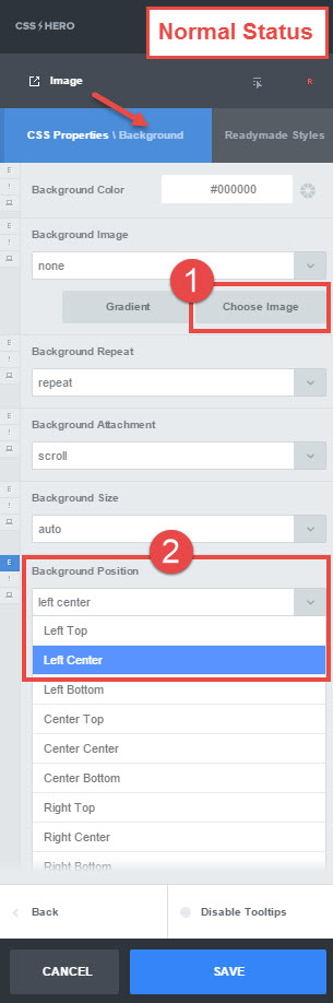
Image position hover – steps 1-2
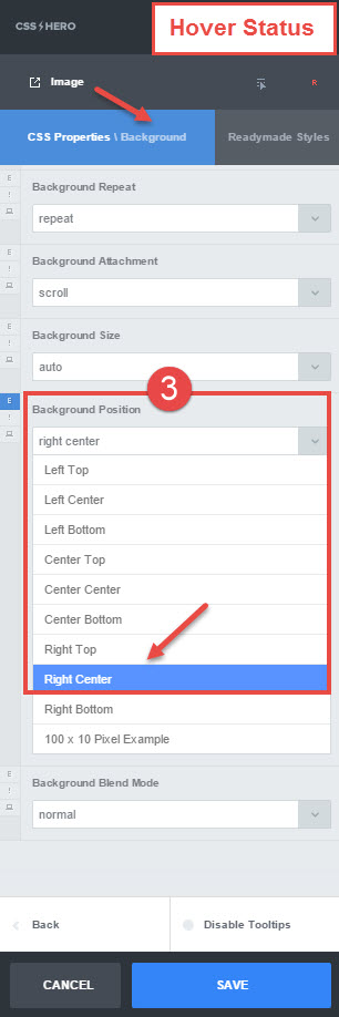
Image position hover – step 3
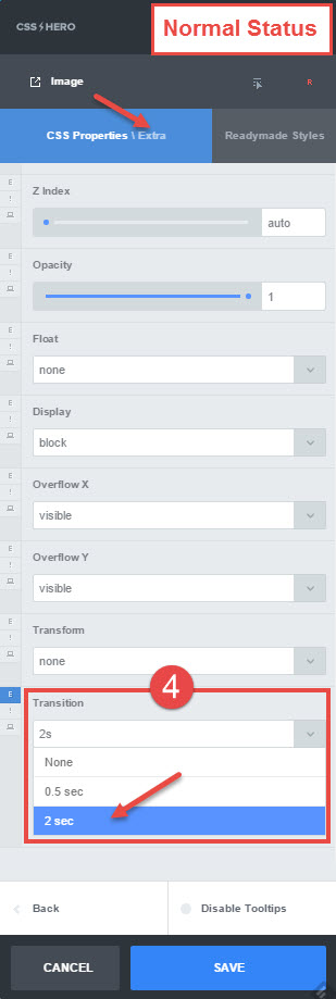
Image position hover – step 4
Scale Hover
This is another cool, dynamic effect. On hover, the image gets bigger, but, unlike in the image zoom effect, it moves outside of the boundaries of the element. Because of that, you need to make sure that your elements are not too close together, so they do not overlap when one of them is hovered over. The more your image scales on hover, the more white space it will need. For the example, we chose the scale rate (1.1) that is noticeable but doesn’t spill over into other images.
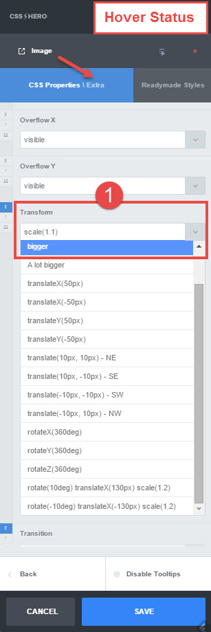
- Hover status. Extra properties. Set transform property to bigger (1.1).
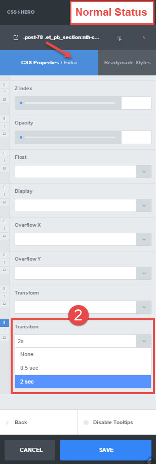
- Normal status. Extra properties. Add a transition (2s is ok) to smooth the effect.
Scale hover effect – step 1
Scale hover – step 2
Hover effects add plenty of movement and dimension to a web page – and are surprisingly easy to create with CSS Hero. We hope you loved these effects and will have fun creating them.
If you have several elements of the same class (image, blurb) on the page, the hover settings applied to one of them will be automatically copied to others, saving you time. If you want the edits to apply only to some of the elements of the same class (but not to all), you can assign CSS Custom class to these elements and edit them separately.
Which of these effects are your favorite? Share your thoughts below.