Is your website too plain vanilla? Does it need a splash of color, a personality or a bit of dimension? All of this can be accomplished by adding a gradient to your site. To convey the right mood, you can go for cool or warm colors, subtle or dramatic color changes, linear or radial gradient – it’s up to you!
In the past, gradients have been used to create an illusion of volume and approximation to the physical world and sometimes looked too aggressive. The more modern flat and material design use gradients in a different way. Because these minimalistic design styles employ few aesthetic elements, both flat and material design use bold colors, including gradients, to enliven a web page and make it memorable. Often, in this case, the colored element takes center stage, spread out full-width.
While gradients are nothing new in web design, it has been easier than ever to create them using CSS rather than the former method of creating gradient images in Photoshop and uploading them to a website. CSS gradients beat gradient images because they reduce load time and scale to any size.
So how do you write the gradient code for your site? You don’t have to – leave that to CSS Hero! All you need to do is kick your creativity into gear, fire up CSS Hero’s point-and-click interface and play with colors.
This article covers steps and tips on creating various gradient effects using CSS Hero.
— Note for Customers: Please download the CSS Hero 2.21 version —
Take a CSS gradient shortcut
Use Readymade Styles
If you are after a beautiful gradient and you don’t mind a shortcut, the first place you should head within CSS Hero is the Readymade Styles. This library of pre-defined CSS settings has plenty of beautiful gradients you could apply to your backgrounds and buttons. Many of these overlay a pattern, making them even more attractive.
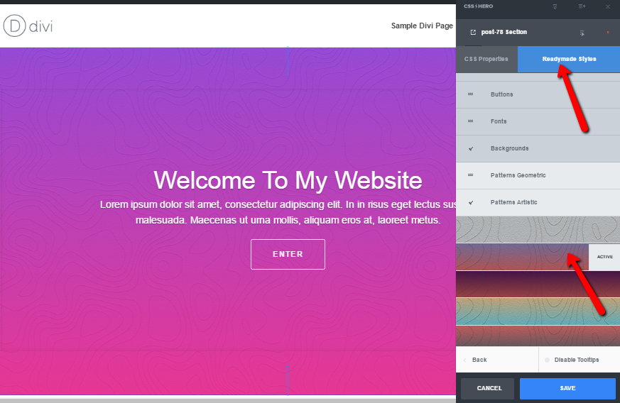
Apply gradients from CSS Hero’s Readymade Styles library to your website
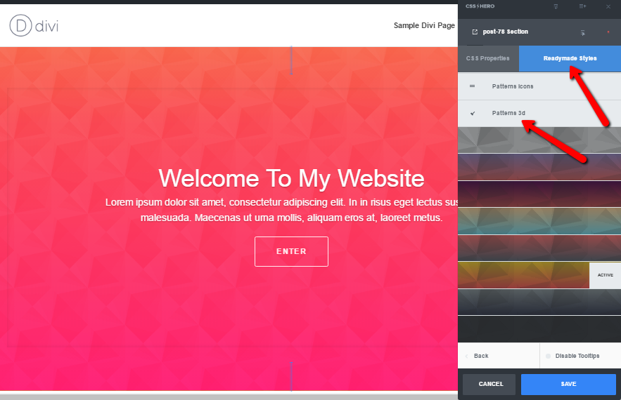
It takes just one click to style your website with CSS Hero’s Readymade Style gradients
The two examples above draw from Readymade Styles Background library, and you can apply these to any elements on your site. In the Buttons library, there are also some gradient styles, such as the Solid Button style you can see on the image below.
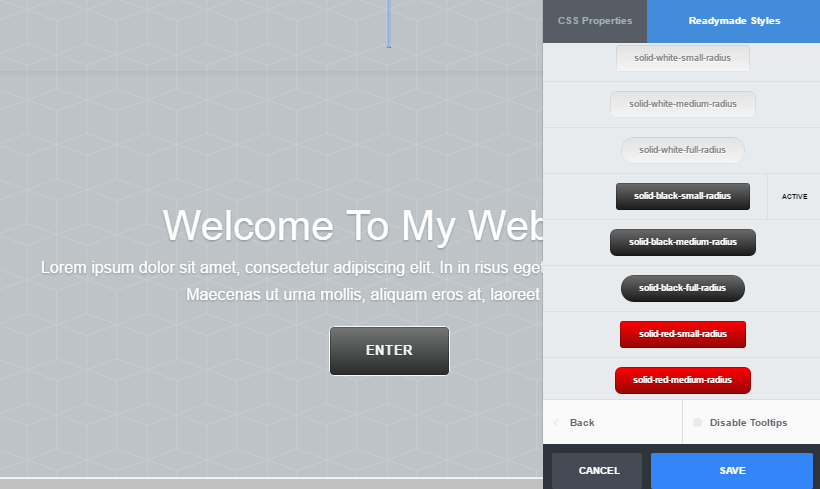
Solid Button Style applied
Check out gradient presets
Another place to get lovely pre-defined gradients in CSS Hero is gradient presets within the Background menu. Head over to Background Image and click on the drop-down list arrow to see gradient presets.
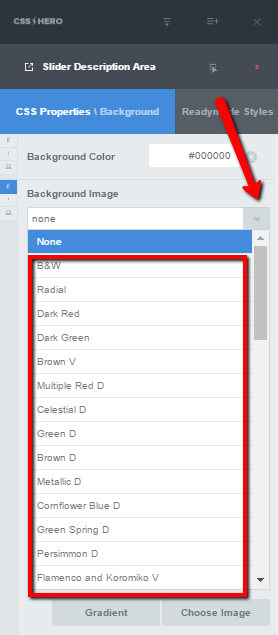
CSS Hero gradient presets
The list includes some neat presets you could apply to various elements on your site. For example, the subtle white gradient below creates a barely perceptible sense of space.
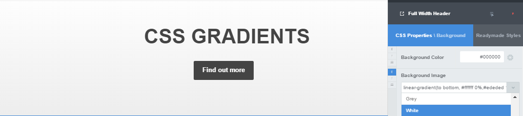
Add dimension to a web page with a subtle white gradient from CSS Hero presets
Preset gradient used on a button
Creating your own CSS gradients with CSS Hero
First, we must say that the gradient creation panel got a recent update, starting with CSS Hero version 2.21. We made it a bit more intuitive and added the option to create radial gradients. Hopefully, you’ll enjoy working with the updated version.
Linear and radial CSS gradients
Target an element for which you want to create a gradient background and head to CSS Properties – Background. Once you click on the Gradient button within the Background menu, you can choose the type of the gradient – linear or radial. Then, pick two colors for the gradient with the Color Picker or by pasting color codes in the appropriate windows.
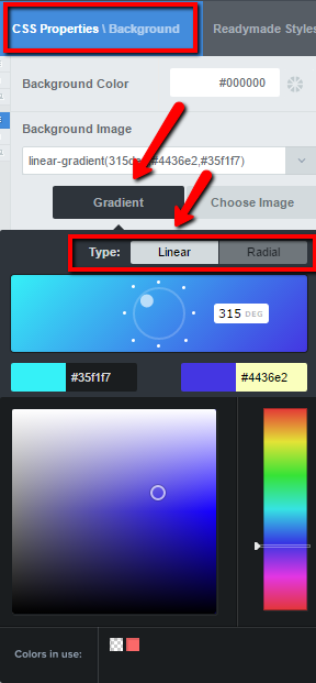
Easily build gradients with CSS Hero
You will also be able to set up the orientation of the gradient. The coolest thing is that you can watch the changes on your website live while playing with different colors and directions. To set the orientation for a linear gradient, drag the white inner circle to change the angle of the fade. If you click on one of the small white dots around the big circle, the angle will be set to pre-defined values – 0 degrees, 45 degrees, 90 degrees and so on.
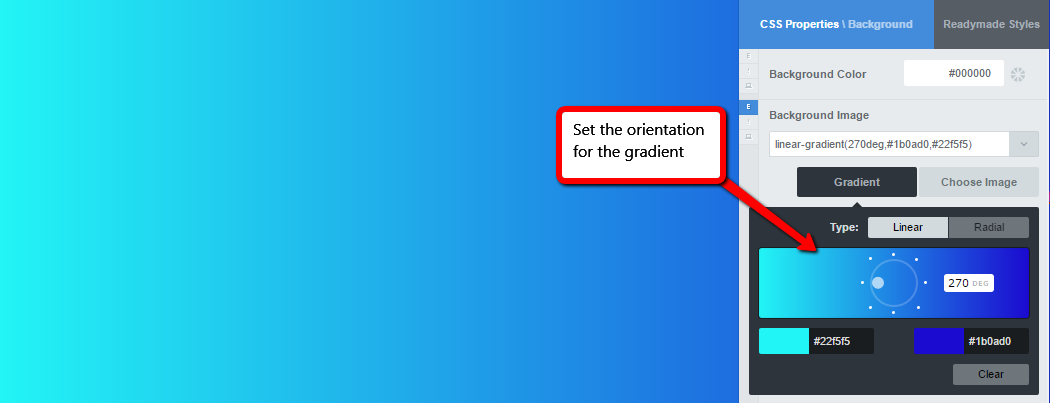
Set the orientation for the linear gradient
The radial gradient is defined by its center – drag around the white circle to set the orientation for a radial fade. You can switch between the gradient types at any point to see what works better.
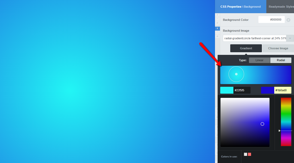
Set the orientation for the radial gradient
Using this tool, you can create linear and radial background gradients for items as small as buttons or as big as full-width sections of your website.
Multi-color linear gradient
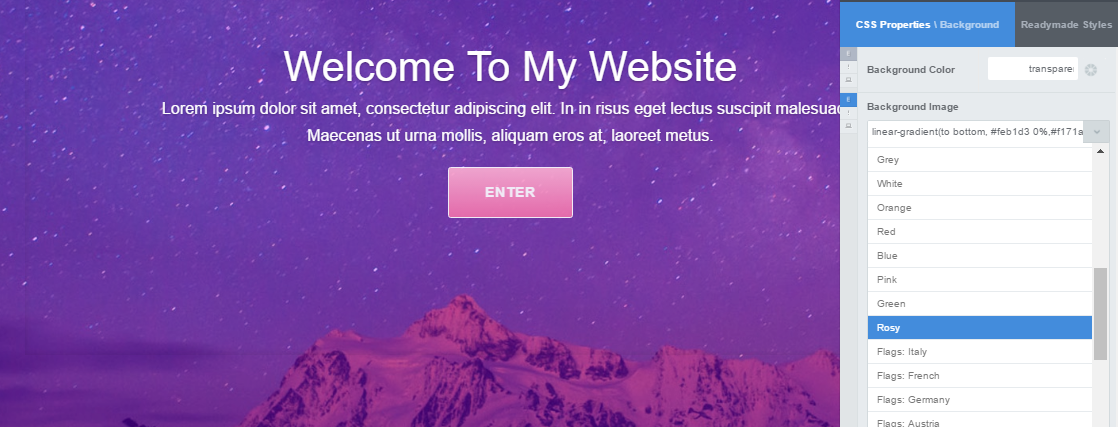
As you can see, there are no fields in CSS Hero to specify multiple colors for the gradient. However, it doesn’t mean that you can’t create a multi-color gradient with CSS Hero. First of all, there are a few multi-color gradient presets (as we mentioned above, you can access the presets by clicking the drop-down list arrow for Background-image property).
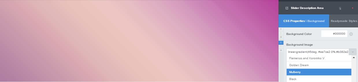
Multi-color Mulberry gradient in CSS Hero presets
But we get it; presets won’t always satisfy your needs. So how do you create your own multi-color gradient with CSS Hero? What you may not realize is that many descriptive fields in CSS Hero can take values other than those from the drop-down list. Which means, you can put your own values in that Background-image field and create original gradients, as long as you follow the same syntax. CSS Hero will do the behind-the-scenes code work and save the changes for you and your website visitors to enjoy.
For example, the full syntax for the Mulberry gradient above looks like this:
linear-gradient(45deg, #ae7ca2 0%,#b382a2 5%,#b584a4 6%,#dcadb3 28%,#deb4b8 30%,#e2bab8 35%,#e7c0bb 38%,#eac5bd 46%,#ebc6c0 46%,#ebc5c4 51%,#eac2c2 52%,#e7bfc0 54%,#e6bdc3 57%,#e2b3c3 60%,#dbaabf 65%,#d9a2c1 67%,#d299ba 71%,#d397bb 71%,#d092b9 72%,#d291bb 72%,#ca84b6 76%,#cb7eb6 78%,#c574af 80%,#c46bad 84%,#bc5ca4 88%,#bd56a5 90%,#b84b9e 94%,#ba439d 96%,#b8409a 100%)
In that syntax, the first number is the angle – the colors are displayed at 45 degrees. All the following items are the color stops, or Hex codes identifying the different colors this beautiful gradient contains. The percentages behind the color codes specify at which point in the image does the new color start. If you want the gradient to be equally divided between the colors of your choice, you can simply skip the percentages.
Using this syntax, you can create gradients that use as many colors as you wish. Simply copy the syntax above in a document where it’s easy to edit it, and paste your own colors and percentages. For example, we created the following simple, 3-color gradient below by pasting the following line in the Background Image field:
linear-gradient(45deg, #00FFFF 25%, #0000af 50%, #7FFF00)
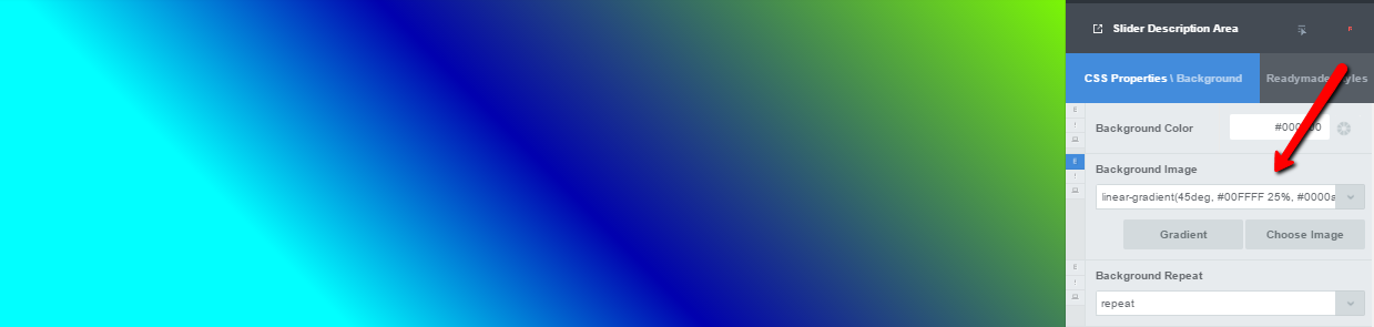
Creating a multi-color gradient with CSS Hero
This roundabout is not as simple and fun as picking colors with a color picker, but it’s still easier than modifying the stylesheets on your own. Plus, you still get to see the changes live on your website and can instantly decide whether you like that gradient, whether you should add more colors to it, or change the angle, and so on. We may add the panel for creating multi-color gradients in the future, but for now, you can still create multi-color gradients this way with CSS Hero. Tip: pay attention that no unnecessary commas or spaces creep into the syntax; otherwise it will not work.
Provide a fallback
Older versions of Internet Explorer do not support CSS gradients, so your lovely fade will not show up in them. To avoid displaying an empty space, simply select a background color to render instead of the gradient.
Add stunning gradient effects
While a gradient can add plenty of character to a website all by itself, combining gradients with images and adding some extra effects can look truly impressive.
Add a gradient overlay to an image
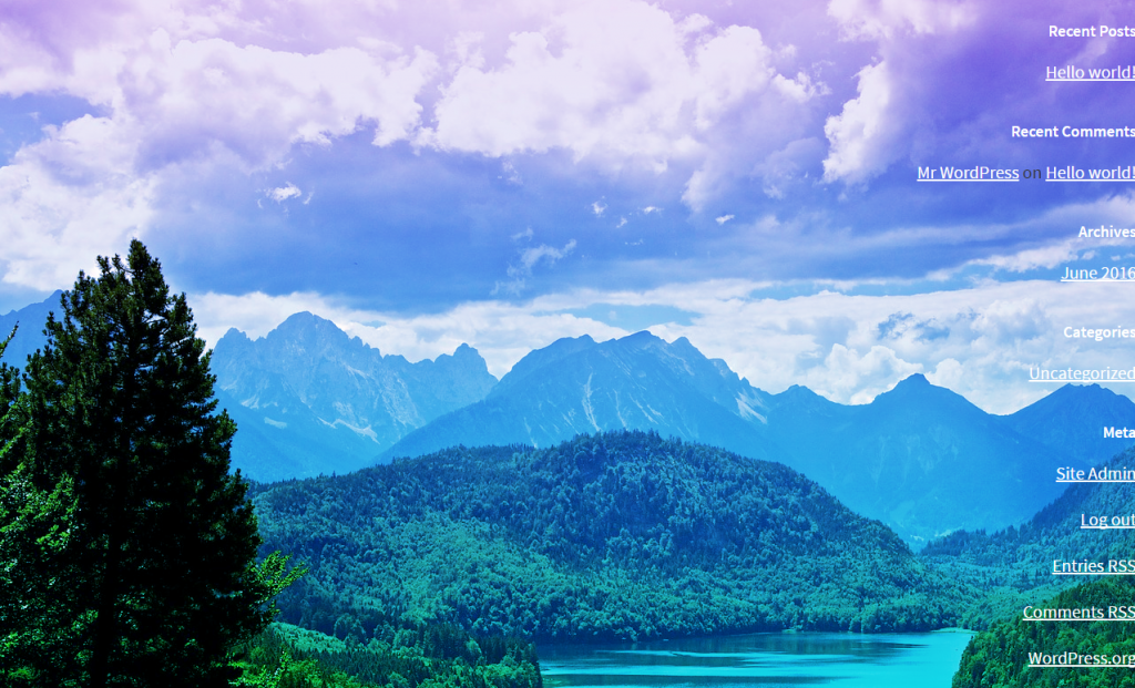
Layering color over a picture enhances its beauty. When looking at it, you may not even realize there’s a gradient overlay, but the effect creates a subtle feeling of dimension and movement. Compare the two images below. While the original photo is beautiful on its own, adding a gradient overlay completely changes its mood, makes it more dreamy, if you will.
From a practical standpoint, having an extra layer of color improves readability of any text you put on top of an image.
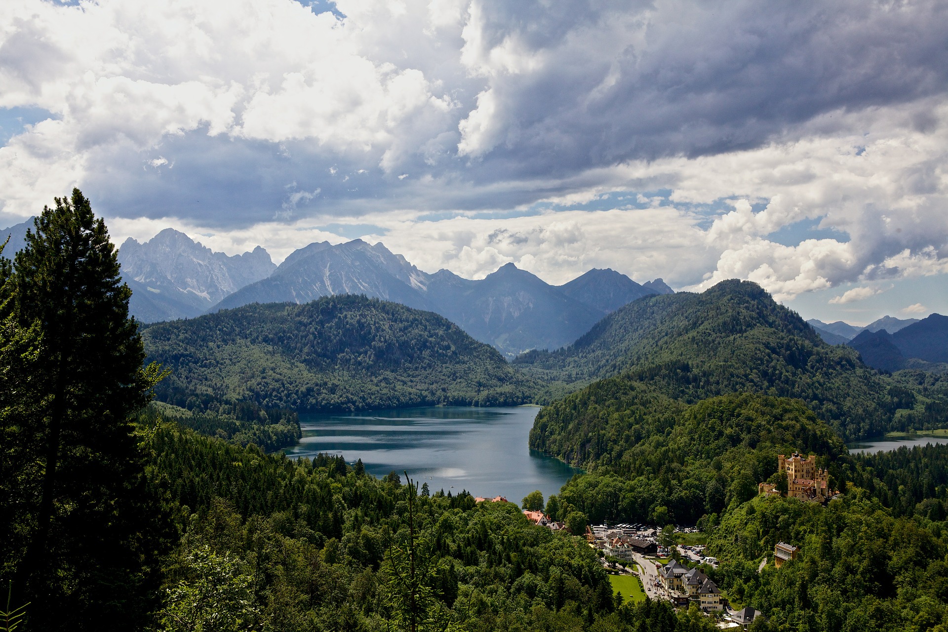
The original image with no overlay effects
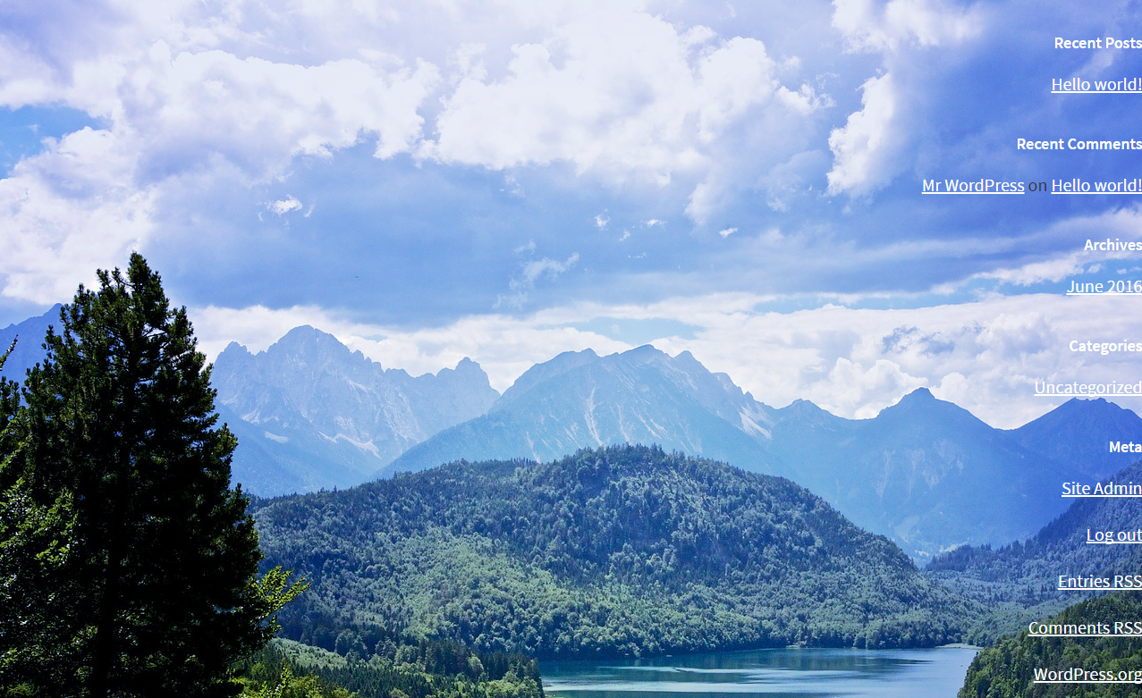
Background image with a subtle gradient overlay
Steps to add a CSS gradient overlay:
1) Add a Background Image
2) Add a gradient (we used a radial gradient in the example above)
As an alternative, you can add a background color at this stage. That’s why it’s so fun to use CSS Hero – you are free to play with different settings and choose the perfect color and effect for you.
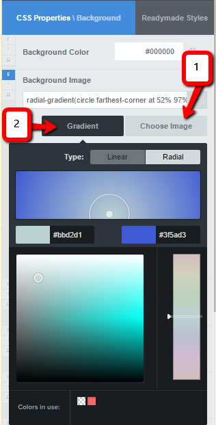
Add CSS gradient overlay to background image – steps 1,2
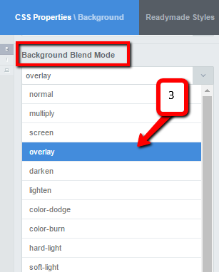
3) Set the Background Blend Mode to overlay
Add CSS gradient overlay – step 3
So, just like that, in 3 simple steps, you can have a gorgeous image with a gradient overlay – neither Photoshop nor coding knowledge needed! By the way, you can experiment with other background blend modes. Some of them, such as Multiply and Lighten, will also give you the effect of semi-transparent gradient layered on top of the image.
Add a gradient overlay on hover
Background image with a subtle gradient overlay

The same image with a different overlay on hover
For an interesting dynamic effect, you can add a gradient overlay on hover. This soft animation can look especially captivating when you have several images displayed in a row. The gradient overlay appearing on hover would provide subtle feedback to the user as he or she hovers over the pictures.
Steps to add a gradient overlay on hover:
1)Normal status. Set the background image.
2)Switch to the Hover status (the screenshot below shows how to do it). In the Hover status, add background image again, add the gradient, and set the Background Blend Mode to overlay.
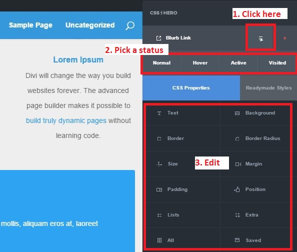
CSS Hero Status Editor Tool
3) Normal status. Extra properties. Add a Transition (0.5s is ok) to smooth the effect.
Over to you: Do you use or would like to use gradients to decorate your WordPress website? Have you ever used CSS Hero to create CSS gradients? Tell us in the comments!