If you are looking at someone else’s website and feeling a strong case of “I want what she’s having,” we may be able to help you. Here are seven easy-to-implement WordPress design effects that will give your website a modern look and a memorable user experience.
1. Flat or material theme design with bold colors
Flat, minimalistic website design has been popular for a while now, and it’s not going away. Users love if for its clean, uncluttered interface and ease of navigation. Material design is similar to flat, but it also uses depth, shadow and gradients to give the website slightly more realistic look. Bold, contrasting colors make this design especially attractive.
How to create this design:
If you are not a graphic or web designer, the easiest way to create a flat theme design is to use a flat theme or a flat theme skin on your website. A theme skin is a collection of preset parameters and includes colors of the main elements, backgrounds, the type and color of the font, and other design elements. After a theme skin is applied, your website will have a unified look that you can further tweak to suit your needs. You can find hundreds of flat themes that will match the needs of your website, be that an e-commerce website or an artist’s portfolio website.
How to make it even easier with CSS Hero:
CSS Hero 2.0 comes with 29 preset flat theme skins that you can install in one click, achieving the beautiful flat design in seconds. Right now, these skins can be applied only to the Divi theme, but we are working on making them available for other themes, too.
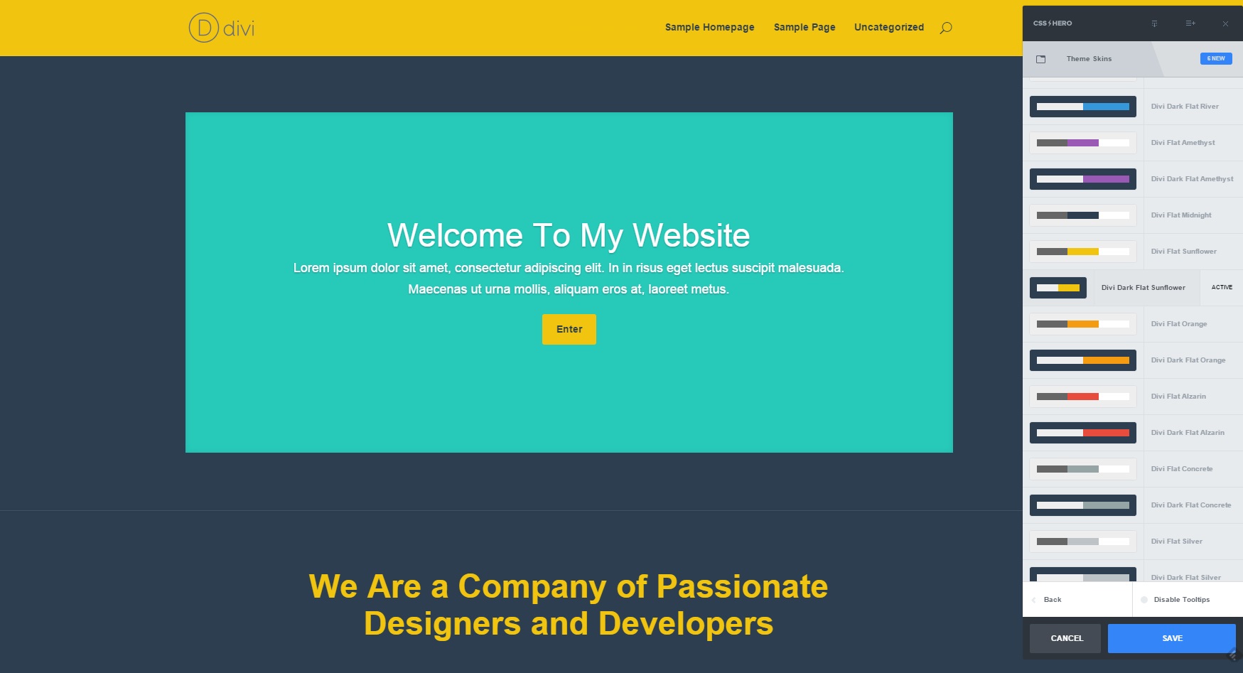
Flat Theme Skin in Bold Colors
2. Large images and videos as backgrounds
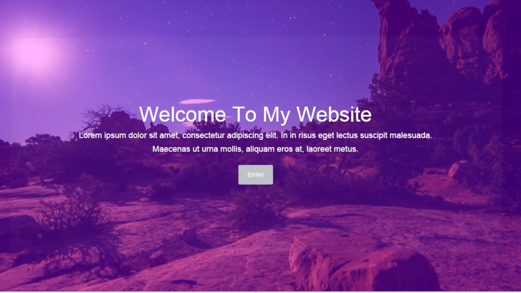
Prominently displayed high-definition, beautiful and relevant image is one of the best ways to catch web users’ attention. That’s why hero images have become so popular. It’s a common (and we should say, attractive) design trend to place a hero image above the scroll, and arrange the rest of the content in horizontal, vertical, zig-zagging, or modular sections.
How to create this design:
- Pick a full-width or a large section in your theme builder
- Upload a high-definition image that reflects your brand – or even several of them to create a slider. Video background is also an excellent option.
How to make it even easier with CSS Hero:
Target the section you wish to edit, go to Readymade styles à Backgrounds à Stock photo backgrounds, and pick from hundreds of beautiful, high-definition images.
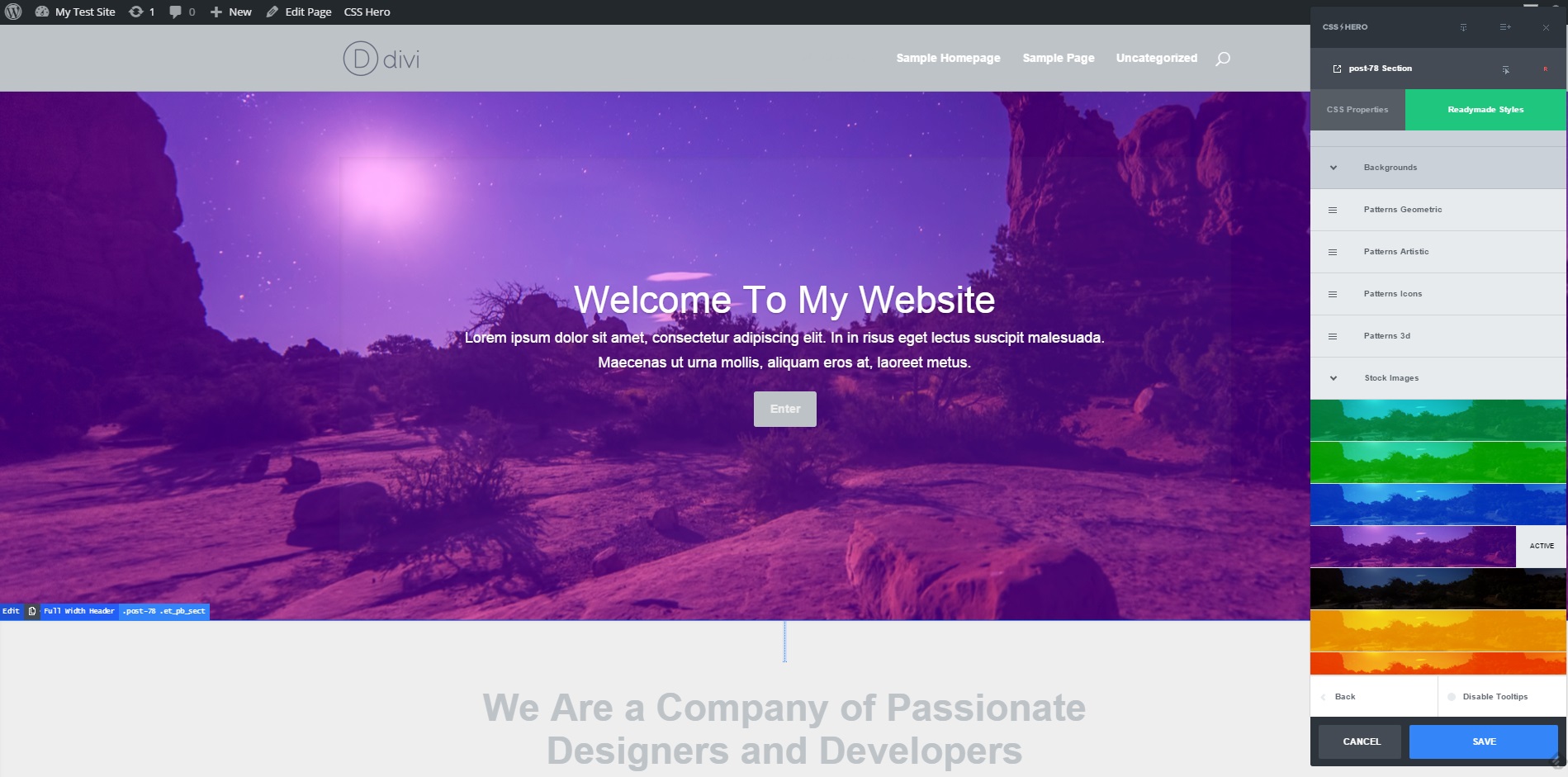
Large Image as a Background
3. Ghost buttons
Ghost buttons are transparent buttons with a thin outline. When a user hovers over a ghost button, it usually changes, becoming non-transparent and shifting its colors. Ghost buttons are unobtrusive, classy, minimalistic, and play especially well with the beautiful large backgrounds we mentioned in point 2.
How to create a ghost button:
Some theme builders allow you to create ghost buttons by setting Border and Background properties accordingly. Otherwise, you either have to be able to change CSS properties of the button yourself, or you need special tools that can let you edit CSS without coding. CSS Hero is one of these tools.
How to create ghost buttons with CSS Hero:
CSS Hero 2.0 has a hundred of Readymade button styles, and most of them can be used to create ghost buttons.
Further, with CSS Hero you can edit the hover status of the button easily while seeing the changes live.
Here are the steps:
- Target the button.
- Pick it from the elements on the list.
- Apply a Readymade button style to it – for example, a Flat style.
- Go back to the CSS Properties column in CSS Hero panel, adjust the Background to transparent and the border to the desired width.
- Now, with the Status Editor Tool, change the background, text and border properties of the button hover status (see the screenshots below).
By the way, these steps also apply if you want to change a hover status of links and other elements.
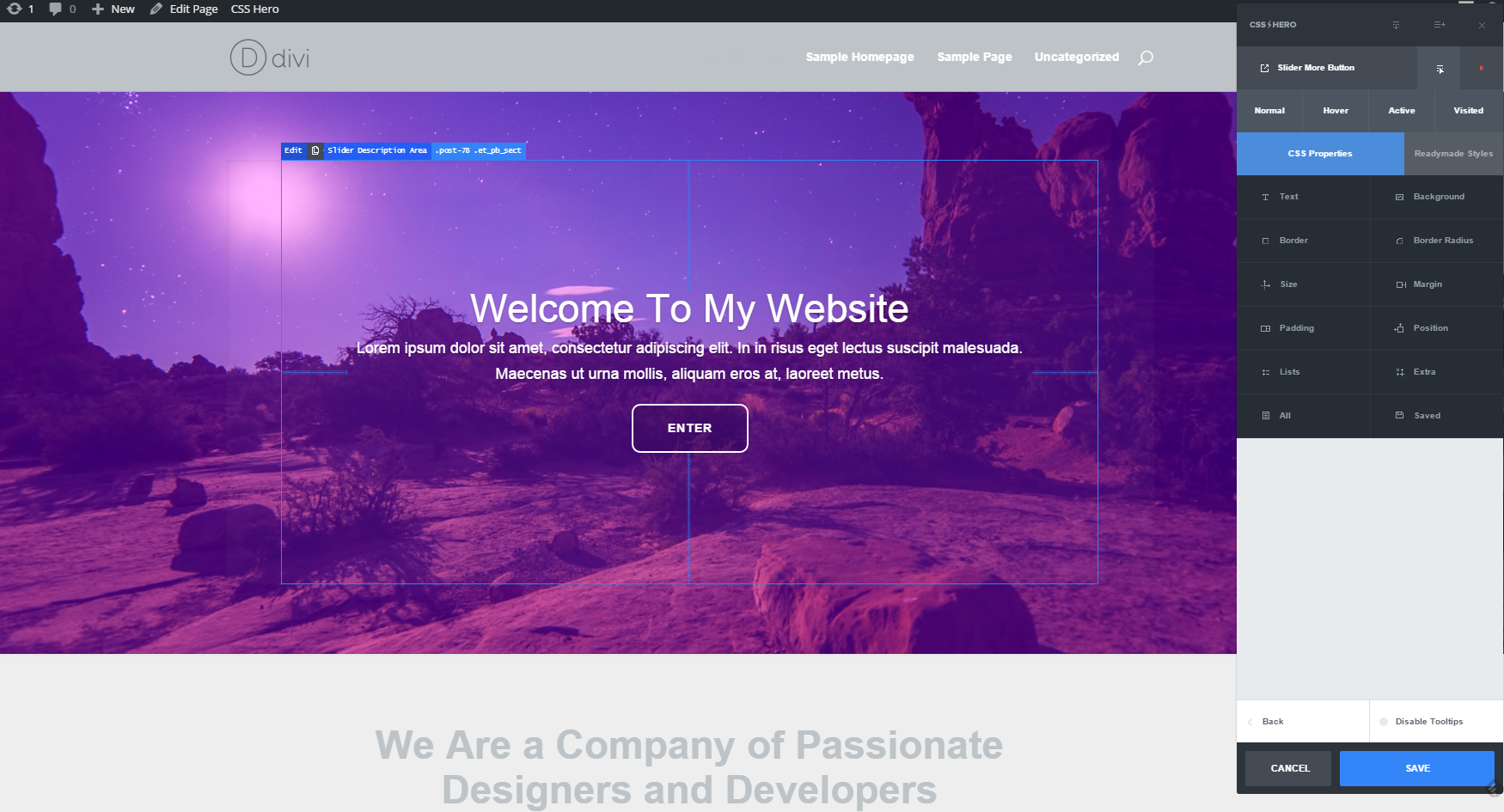
Creating a Ghost Button with CSS Hero
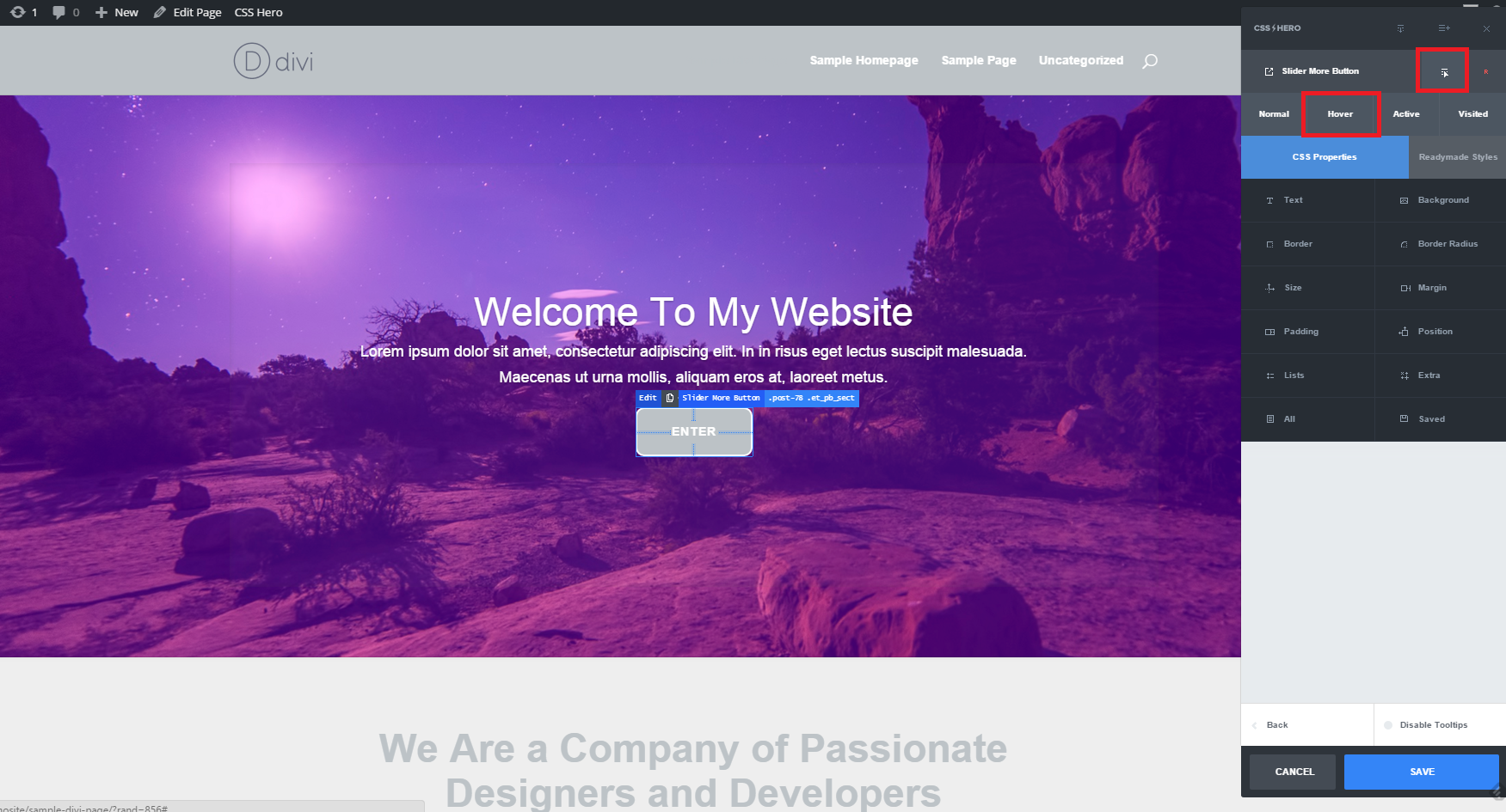
Changing the Hover Status of the Ghost Button
4. Long scrolling pages
Have you heard, scrolling is the new clicking? Long scrolling pages improve reading flow and eliminate clicking around (and loading!) a bunch of sections. With the ever-increasing use of mobile devices, we grew used to consuming a brand’s story in one long scroll.
How to create this design:
Using a website page builder, create one long page instead of several separate pages. To separate the different sections of the page, use color, different backgrounds, and modular effects.
How to make it even better with CSS Hero:
Added in the CSS Hero 2.0, Readymade styles provide an abundance of beautiful backgrounds for you – several hundred of backgrounds, in different shapes and colors. Get creative and apply these backgrounds with one click to different sections of your long scrolling page. Finally, adjust padding, margins, and borders between the sections to either merge or separate them.
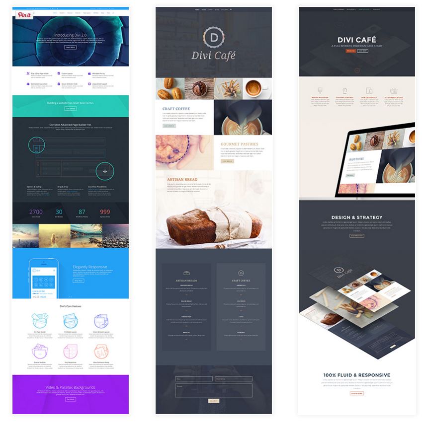
Long Scrolling Pages. Photo Credit – Elegant Themes
5. Modular / grid / card design
Pinterest-inspired, card-based design has gained popularity because it makes information easy to scan and consume. Webpages arranged in modules, grid or cards are clean and versatile. Both visual and textual content benefit from being organized and laid out in a purposeful, attractive way. Modular design improves user experience because they can quickly get to the module they are interested in.
How to create this design:
Use a modular theme, such as Fullby, Modular, and many others, or build modules using a page builder.
How to make it even better with CSS Hero:
Once you’ve built the page with a page builder, launch CSS hero and make this modular design uniquely yours by adjusting margins, colors, fonts, hover state of things, borders of the elements and more! You can give your modules as much or as little white space as you wish.
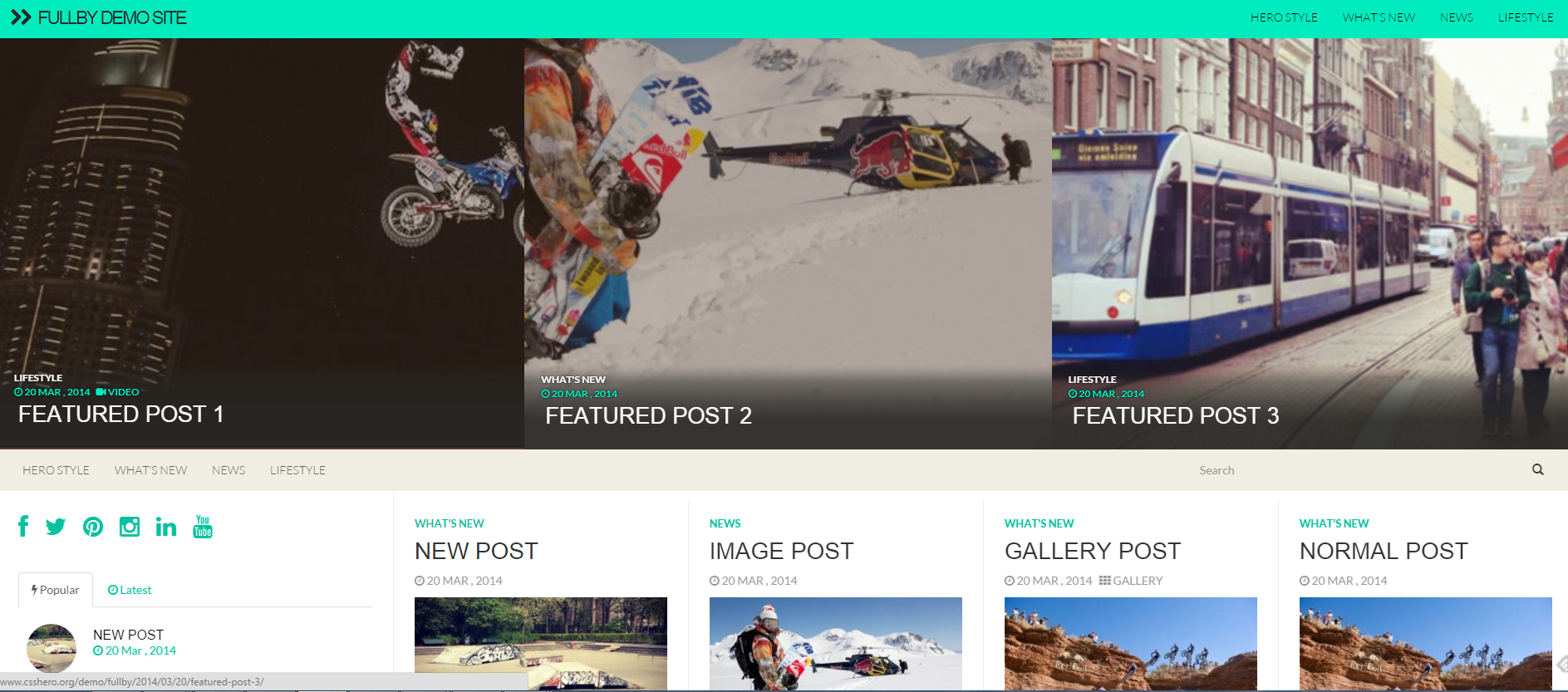
Modular Design – Fullby Theme
6. E-commerce
You’ve put a lot of time and hard work into your blog or product. Your website visitors admire your creativity and trust your competence. One of the best ways to help them and to give yourself more leverage is to monetize your website by embracing e-commerce.
How to easily add e-commerce capability to your website:
Plugins like WooCommerce, Shopify, and Easy Digital Downloads make it possible and even easy to turn your website into an online store. There also plenty of e-commerce themes.
How to make it even better with CSS Hero:
Visual customization options of e-commerce plugins are rather limited. CSS Hero can help you ditch the default look and turn your store into something unique. Edit any buttons, links, backgrounds, photo styles and more to fit the overall look of your website. CSS Hero enables you to clone a style of an element easily so it will take only a few clicks to edit a bunch of product photos, for example.
Tip: Canvas, Woothemes’ flagship theme, and WooCommerce plugin are both CSS Hero–ready, which means they work well together and make your life (and website editing process) easier.
7. Responsive design
This one is a big deal. We are firmly in the post-PC era. We shop, read, communicate and get our news and emails through our phones and/or tablets. And we have no patience for pinching a non-responsive website anymore (remember that?). The truth is, these days we don’t even visit non-responsive websites that often: They get penalized by Google and end up on the umpteenth page of the search results. So hopefully we can all agree that responsive design is a must.
How to create a responsive design for your website:
Get a responsive theme, if you don’t have one yet, or make sure that your developer custom codes your website to be responsive.
Since responsive design is the new norm, most of the modern themes come responsive out of the box. However, even with a mobile-friendly theme, you will still want to adjust the way certain elements look on smaller screens. CSS Hero has an easy way to do it.
How to make it easier and better with CSS Hero:
Use the Responsive Editor Tool: With CSS Hero, you can switch to a particular device view when editing, so that edits apply only to desktop, only to mobile devices or only to tablets. You can even customize the vertical and horizontal versions of your website. This makes for an outstanding user experience on any device.
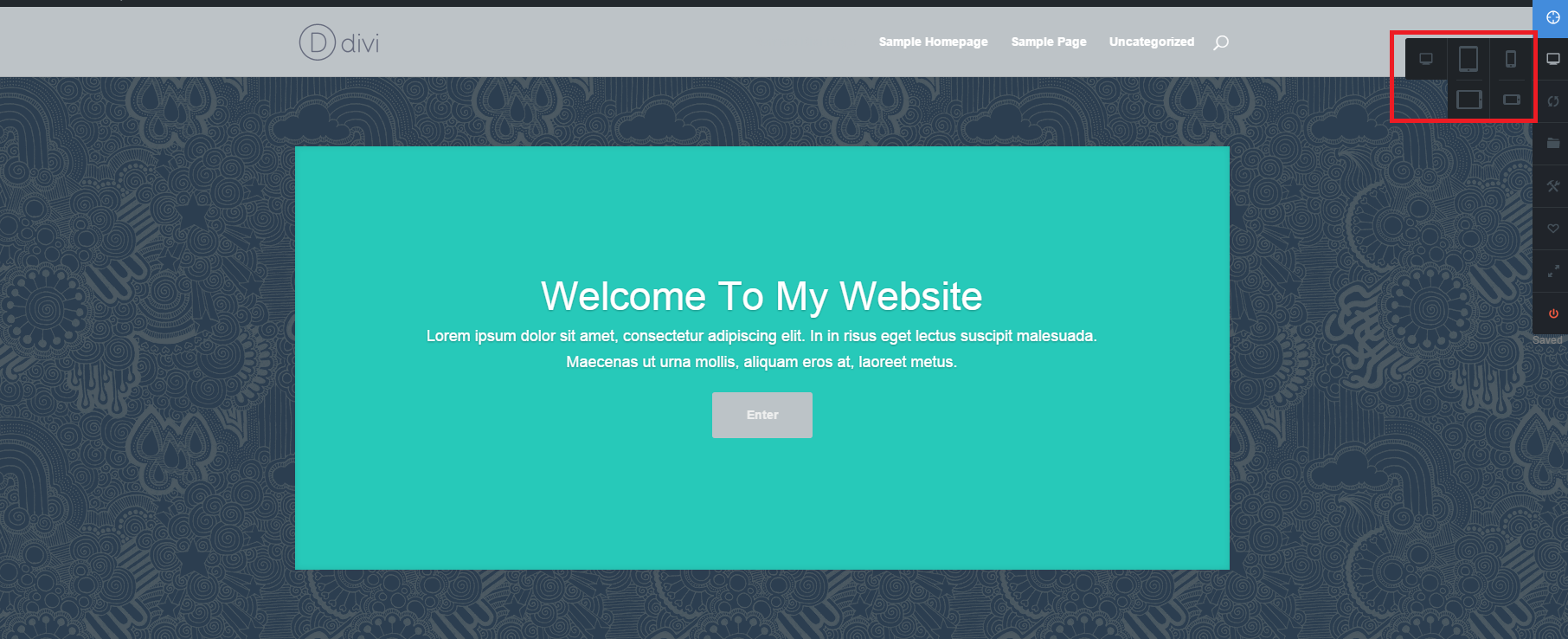
CSS Hero Responsive Editor Tool
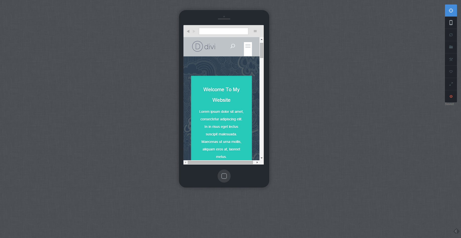
Editing CSS in the Mobile View
The easy WordPress design effects mentioned here are fairly universal and can benefit almost any website. Responsive design, clean flat style and emotion-evoking images have mass appeal and can do wonders to attract and retain visitors on your website. And since these design effects are so easy to create, why not experiment with different ways of presenting information on your digital hub?
Take CSS Hero along for your design journey, and you may find that adding trendy elements to your website is more fun and easier than you thought.
Over to you: Which of these WordPress design effects are you eager to try or already have on your website?
If you think any of your friends could benefit from these tips, please share this article with them.