
Since 2015, more searches happen on mobile devices than on desktop. What does it mean for developers and website owners? Creating a fluid, responsive experience for website visitors no matter which device they are on remains the highest priority. CSS viewport units can help you reach that lofty goal.
One of worst mistakes you can make in web design is specifying element size in absolute units – such as pixels or points. For example, if you use CSS Hero (or any other CSS editor, for that matter) to change the Size property to absolute units, it can mess with the responsiveness of your theme, and the elements will no longer automatically adjust to the size of the device.
One way to combat that with CSS Hero is to use “Desktop only” switch when editing. This will allow you to create a large element or heading on desktop and leave your theme’s settings for mobile responsiveness as is.
However, sometimes the default theme settings just don’t give you the style you are looking to implement on mobile. That’s where CSS viewport units come in VERY handy. These relative units give you more control over the size of the elements such as titles that you may want big on a large screen and smaller on a mobile device.
Viewport units enable you to express the size of an element as a percentage of a viewport size, or the area of the screen used to display information.
Of course, this area varies widely between all the different models of phones, tablets, laptops and desktop computers. Because of that, reliance on one particular viewport size (let’s say designing your mobile pages for iPhone 6 with the screen width of 375 pixels) is not a good responsive design practice. The elements on your pages will be too big for smaller devices such as iPhone 5 and too small for a larger Samsung Galaxy S6.
With Viewport units and their percentage sizing you no longer have to worry that your design will not render well on a differently sized device. Viewport units cause elements to scale accordingly on window resize or device rotation.
Vmin, Vmax, vh, vw: “modern” viewport units
There are four different viewport units. Two for each axis, and a minimum and maximum value of the two.
- vw: 1/100th (or 1%) of the actual viewport width
- vh: 1/100th of the actual viewport height
- vmin: 1/100th of the smallest side of the actual viewport
- vmax: 1/100th of the largest side of the actual viewport
You can use viewport units anywhere you can specify a value in pixels – for example, with Width, Height, Margin, Font-size and other properties. However, it doesn’t mean you have to rush and change all of your measurements to viewport units. Although these useful units are now supported by all modern browsers, you will still have to provide fallbacks for those who don’t – so, in the end, it might be more convenient to use other relative units (ems, rems, %). But there are some particular cases where viewport units are extremely useful.
Titles and Headings
If you want your heading to always span a particular portion of the screen, viewport units are the way to go: Your heading will scale to any screen size. You will even save time on creating multiple media queries.
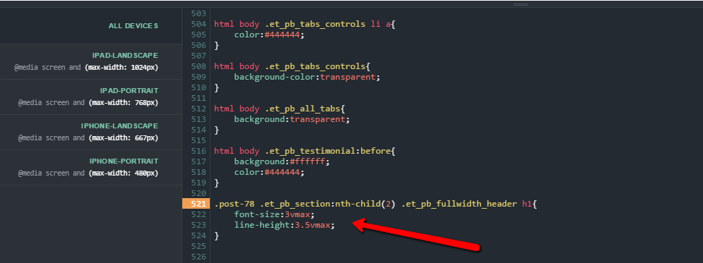
As you can see on the screenshots below, the procedure for using viewport units is exactly the same as for any other measurements – simply specify the units in the value window for the property you are trying to change. In the first example below, the Font-size for the title is set to 3vw, so it will equal 3% of the browser window width. In the second example, Font-size is set to 3vmax, so it will equal 3% of the viewport width on horizontally oriented screens and 3% of the viewport height on vertically oriented screens.
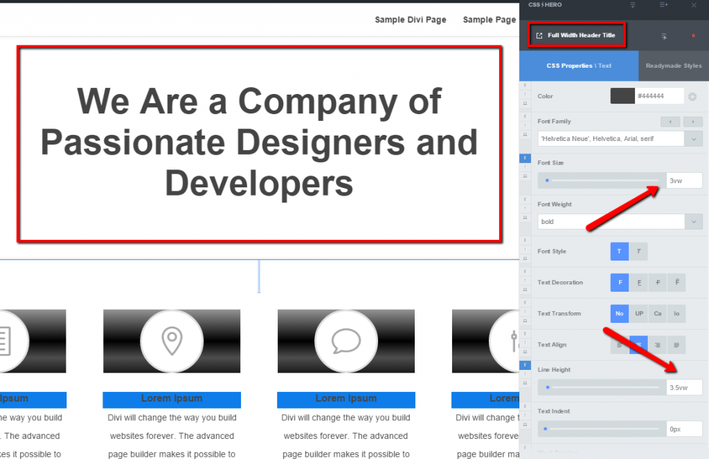
Setting Font-size for a title in viewport units – CSS Hero
You can also set sizes in viewport units through our new Inspector PRO (CSS Hero add-on).
Setting Font-size in viewport units – Inspector Pro (CSS Hero add-on)
Below is the mobile view of the title we targeted. The first image is made with the default theme settings. The second – after the Font-size of the title was set in viewport units. Even though the latter isn’t perfect, it’s better than the oversized title we get by default.

1. Mobile view of the title – Default theme settings

2. Mobile view of the title – with Viewport Units
Creating an element that covers the full height of the page
CSS viewport units make this easy, unlike other ways of specifying size. So if you are looking to create a trendy full-screen hero image or slider, viewport units are a quick and elegant solution.

Viewport units will help you make this purple section with a slider take up the full height of the page
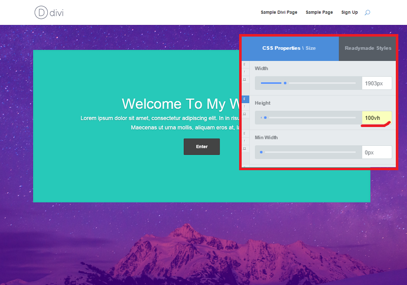
Set the height to 100vh to create a full-height image
Responsive aspect ratio
Declaring height, width, padding or margins in viewport units will help you preserve the aspect ratio of the layout no matter the device.
For example, you want a rectangular element to be always vertically centered on the page. By setting its height to 50 vh and top and bottom margins to 25 vh, you can achieve that effect easily.
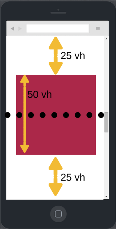
Vertical centering with viewport units
Similarly, specifying the padding after a title in viewport units will ensure that your title has enough breathing space on desktop – while not creating big padding gaps on mobile.
Viewport units are easy to understand and experiment with, and they can be extremely helpful in responsive design. Have you used viewport units? In which cases do you find them the most useful? Share your insights in the comments.