“To improve my website’s usability” may not be your typical New Year’s resolution. However, it ties directly to the “Improve my finances” resolution, which is one of the top three resolutions people make every year. You see, 50% of online sales are lost because visitors can’t find the information they need, according to Forrester research. And yet, 49% of sites do not follow the basic usability principles, such as presenting information in an easy-to-digest, logical way, and placing it where it can be easily found. Working to improve website usability can benefit your bottom line. In fact, it can increase your conversions and sales faster than any other marketing initiative.
Because of all this, we decided to take a look at how CSS Hero can help you make your website friendlier, more intuitive and, ultimately, more profitable. Below are five common usability standards and how to implement them with CSS Hero.
-
Clear and consistent visual hierarchy.
Have you ever been on a website that looks like a cluttered closet? Did you buy anything from it? Our bet would be no. Poorly organized websites look unprofessional, confusing and even overwhelming. Don’t be that guy. Instead, create a scannable layout with clear headings hierarchy that is consistent throughout the website.
By going to the Text property within CSS Hero interface, you can easily adjust color, size, font and typeface for titles and headers, creating different header styles that will guide your visitor and highlight the important information. Possibilities are endless here, but try to stick to 4 or fewer colors for text; otherwise, it gets confusing.
-
Clearly defined links.
It is a common usability practice to color and underline the link text to show that it is clickable. Users shouldn’t have to guess or hover all over the page to find links.
Blue is the best color to use for links since it has become a standard convention to represent a hyperlink. Adding a hover effect to a link, such as color change, will further show users that the link is clickable. However, it is important not to rely on color alone since about 8% of men are color-blind. The growing senior population also has difficulties distinguishing between small elements, so underlining a link will make your website more usable for anyone with visual impairments.
Finally, it is important to define visited links, to save your users the frustration of revisiting the same pages over and over again. User experience (UX) experts recommend picking a paler version of the regular link color for the visited link, so if your links are blue, for example, make the visited links light blue.
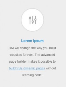
Link Visited Status
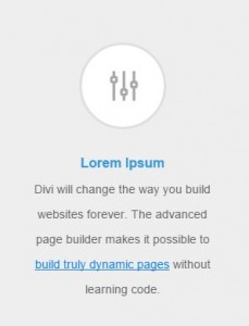
Link Normal Status
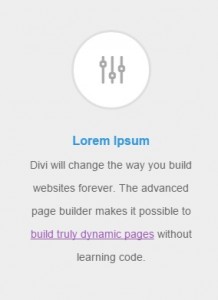
Link Hover Status
How to define Normal, Hover, Active and Visited status with CSS Hero?
All this may seem like a lot of work to tweak just a small detail. However, clearly defined links make a huge difference in website usability. The good thing is, styling the normal, hover and visited statuses of links is quick and easy with CSS Hero Status Editor Tool. Once you have edited one link, CSS Hero will automatically update the rest of the links on the page unless you applied CSS Custom Class or Custom ID to some of them.
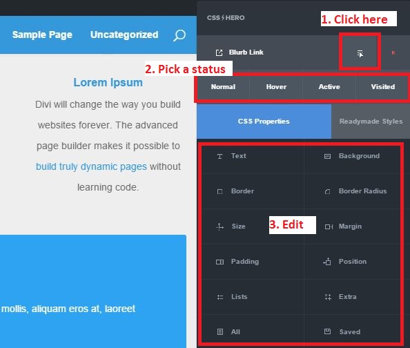
CSS Hero Status Editor Tool (i.e. the Blurb Link)
-
Easy-to-read font size and spacing.
One of the biggest UX myths is that people actually READ on the web. They don’t. The vast majority of web users merely scan the web pages to quickly find the information they need. And if they don’t – they abandon the page, or, even worse, the shopping cart. On average, only 28% of a web page text gets read, according to research by Nielsen Norman Group. This makes it crucial to maximize the opportunities to get your message across.
CSS Hero enables you to customize fonts on any theme, so you can pick a web-friendly font, set it to be large enough and then pick a color that contrasts sharply with the background. White space also affects readability: Adjust letter, word, and line spacing with CSS Hero to make sure your text is not crammed together.
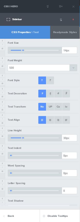
15 different settings to customize text with CSS Hero
-
Important information placed in visible spots.
Eye tracking research shows that web users “read” pages in an F-shaped pattern.
Eyetracking research. Users read in an F-shaped pattern. Photo credit – www.useit.com.
Make sure that you place the important information along the vertical and horizontal lines of that F. For example, place your website tagline and call-to-action in the upper horizontal line, blog post headings in the bottom horizontal line, and navigation or other attention-getters along the vertical line on the left side of the screen.
Next, help users find the right information by styling individual elements in bold, noticeable colors. A few obvious examples are sign-up forms, calls-to-action, and special offers. The default theme or page builder settings may leave these elements looking a little “blah.” CSS Hero is again here to help – use it to change background or font colors, add borders or shadows, and give your elements some space by increasing padding. Use backgrounds to create a captivating scrolling narrative, or to separate sections with color. CSS Hero Readymade styles are a great help in styling elements in one click. Give Readymade styles a try next time you are editing a form, button, or section of your website.
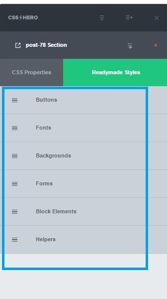
CSS Hero 2.0 Readymade Styles
-
Logical navigation.
Don’t rely on website search function to make up for poor navigation. Research shows that over 70% of users prefer to click on links rather than use the search function to arrive at the information they need. It is easier to recognize a correct navigational link than recall a term and then search for it.
That’s why content organization and logical information structure are so important. So is placing the navigation menu in a place where users expect it to be – across the top of the page or on the left side of the page for a vertical menu. Using simple, short, familiar words for the navigation menu will ensure that it is uncluttered and easy-to-understand.
CSS Hero helps you style navigation menus, links, and website sections so you can guide visitors to the information they are looking for. Often, this functionality is not available through theme settings, and a tool like CSS Hero enables you to improve website usability and design at the same time.
Take a look at the examples below. With CSS Hero, you can set the color and size of your navigation bars, create tabbed effects for navigation menus, or edit the link colors of the active page.
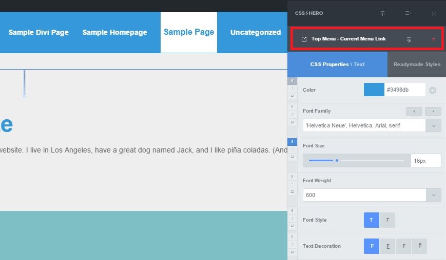
Style navigation menus with CSS Hero
Below is an example of highlighting important information so your visitors don’t miss it.
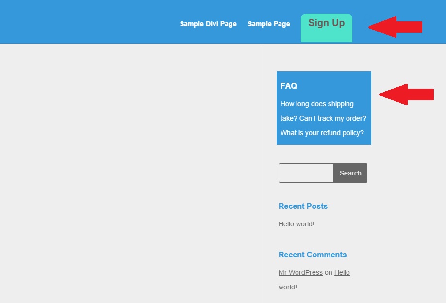
CSS Hero helps you make the most important content stand out
Finally,
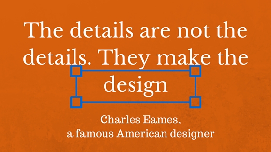
Some of these usability guidelines may seem nitpicky. But together, they “make the design,” the user experience, and even affect your revenue.
Naturally, any of the usability changes should be done with your visitors and their online behavior in mind. Think about their age, gender, online habits and device preferences. We hope that CSS Hero gives you enough tools to cater to any audience and make website changes that help you serve them better.
Over to you: Do you need to step up your website usability? What website changes made a difference in your users’ experience in the past? Share your stories with us.
