
Your website is your online home. And when it’s time to style that home (aka customize your theme) and make it attractive and convenient for you AND your visitors, it’s easy to get carried away. Theme customization is a fun, creative process, especially when you can change anything and everything with a visual editor like CSS Hero.
However, if you don’t introduce some systems to your styling process, your site will soon look like a hodge-podge of fonts, colors, and elements. Every page will present a different experience to your users, confusing them and likely causing them to bounce. Even CSS Hero will be of limited help here. The plugin can help you edit your website easily, but it’s up to you to keep track of the edits and make them coherent and consistent.
Creating a web design style guide will do exactly that. A style guide is a resource that describes the visual elements used on your site and the rules for how they interact with each other to create a unique and cohesive experience for your visitors.
Why bother creating a web design style guide
Consistency
You might think a style guide is something only the big brands have the time to worry about, but consistency plays a huge role, even if your site is five pages long. How do you think your website visitors feel if they see one color palette on your home page and an entirely different one on your services page? Probably confused. And confused people do what? That’s right, they bounce.
Speed
Having a style guide is convenient, and it speeds up your work. Think about it, how many times when creating a new web page have you thought, “Have I used H3 or H4 for this subhead in the past? What font and text treatment have I used for image headings? Where did I paste that Hex code for my accent color?”
If you have taken the time to write down your winning color and style combinations in a style guide, you can refer to it and easily answer these questions. If not, you might waste a lot of time digging in other pages’ settings for the answers.
Finally, if or when there are more people than just yourself working on your website, having a style guide makes for a seamless and quick handoff.
What should go into your web design style guide
The length and content of your style guide will depend on the stylistic elements you use on your site, but here are a few starting points.
Colors
What are the dominant and secondary colors in your color scheme? Write down their color codes. How is each one used – as a background or as an accent? Will you use any gradients?

Read about Coolors and other handy tools for creating a gorgeous color scheme for your site
Typography
What are your primary and secondary typefaces? How are they used for different elements on your site? Which typeface in which color, size, weight, and spacing is used for H2, H3 and so on? What about form headings? Do list items have a different line height than the regular text? There’s a lot that goes into maintaining design consistency. Aim for all similar items to have the same type treatment, no matter where they appear on your site.
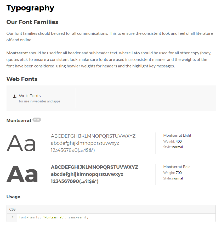
Typography section of a web design style guide by Frontify
Images
What are the sizes of images for different elements, such as blurb vs. blog image, for example? When you have the dimensions handy, it makes it easier to resize graphics and ensure that they don’t look cut off or stretched, making your site look unprofessional. What is the overall style of the images you are going to use – sleek modern or funky retro? Illustration or photography?
Do you apply any color overlays to images? Overlays create a mood and also make any text on top of the image more readable. Ideally, you want to use the same color treatment across your site, so you don’t have photos that look dimmed and cold on one page while the next page looks bright and warm.

Image color treatment: Background image with a subtle gradient overlay
Spacing
Together with size, spacing helps visitors establish the relationships between different elements on your site and grasp your core message. When used correctly, spacing helps improve both the aesthetics and usability of a site. Determine how much white space you want in your design – lots or just a touch?
If you adjust spacing by changing padding or margins between the elements, make sure to write it down in your web design style guide. How much white space do you want around your logo? What about the items in your e-shop? Between the articles on your blog? Around pull quotes or in your sidebar?
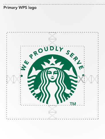
Starbucks logo clear space guidelines
Buttons styles
Are the buttons going to be the same size and color on every page? If not, then how are the buttons for each section defined – hero image button vs. form button vs “Read more” button? Do the buttons have any animation or on-hover effect?
Behavior
How do items move and behave? Which types of elements are clickable and which ones are not? Are any hover effects applied to links or images? Which animations are applied to which elements? Make the behaviors and animations uniform throughout the site, so there’s not too much discordant or confusing wiggling and bouncing.
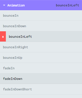
Adding animations with CSS Hero Animator
Format of a web design style guide
While you can use any format convenient for you, from a Word doc to Adobe Illustrator, there are also web tools developed specifically for creating style guides. They introduce automation and organization to this process and make it easier for multiple people to access and edit the style guide. These tools enable you to save your design guidelines in different formats – as images, descriptions or even code. Check out the list by Hongkiat linked above and pick a web client that suits your needs.
Create style guidelines in different formats in Frontify
Implementing consistent design
Your style guide will evolve as you are editing your site with CSS Hero or any other theme customization tool. Have fun experimenting and record the winning combinations of colors, images, fonts, and spacing in your web design style guide.
So how do you apply edits across your whole site and achieve that professional look and feel? Let’s say you want your H2 to use a custom font in your signature blue, in cursive, with a line height of 1.4 em. You can do all that with CSS Hero in a matter of 2 minutes on a specific page. What happens then, you might wonder, do you have to make those edits on every single page where H2 appears? Ouch. Sounds tiresome.
The good news is that most theme configurations aim for design uniformity right out of the box, so if the main theme stylesheet styles two elements the same way, CSS Hero will also automatically style them the same way across your website, meaning you won’t have to go to every page to adjust that H2.
However, on some themes, including some popular builder themes, this won’t work – you will have to test and see for yourself. In that case, how do you make your headings uniform, without spending a lifetime editing them? Enter CSS Custom Class, an awesome tool for creating repeatable styles.
For example, you want to change the style of multiple H2s all across your site. As long as each H2 is assigned the same Custom Class, once you update one of them with CSS Hero, you will have updated all of them!
You can add CSS Custom Class to the headings either via theme builders such as Divi, Enfold, and others, or by manually adding a short piece of code. Let’s say it’s a .customTitles class, for example.
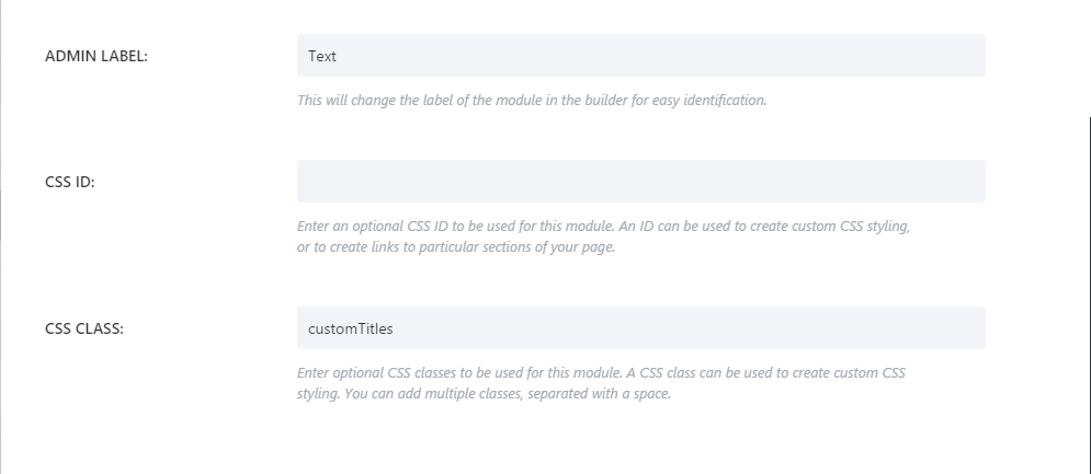
Adding CSS custom class in Divi theme
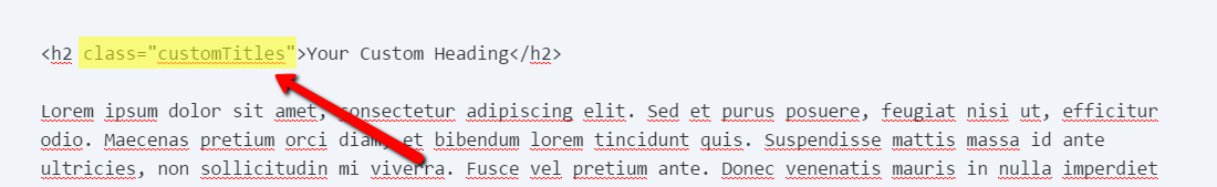
Manually adding a CSS custom class to a heading
The next step is to add the custom class to CSS Hero via the Quick Configurator tool. Make sure that you put a period before the class name and put each class on a separate line. Then click Save Selectors.

Quick Configurator Tool at the top of CSS Hero panel
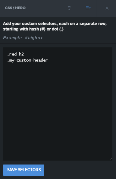
Saving CSS custom classes in Quick Configurator
Now, when you target that heading with CSS Hero selector tool, you will see it labeled as the custom class that you assigned to it. And when you style that H2, all H2s with the same class will be modified.
Moreover, you can extend this concept by chaining multiple classes. For example, you want your H3s to share the font and other properties of your custom H2s, but you want them to be red. What you can do is apply the .customTitles class to your H3s, but also add .redTitles class.
H3 in Red
You would need to add this new, chain, custom class to Quick Configurator: .customTitles.redTitles. Now, when you style these H3s, the changes will only apply to the elements sharing both classes.
It’s not a bad idea to add the names and screenshots of your CSS Custom Classes to your web design style guide. Next time you have an H3 on a page, you will know which Custom Class to apply to it, and voila – the heading automatically dons the custom styling that you have set up in CSS Hero ages ago!
Over to you: Do you document in any way the changes you make to your site? What are your best tips for implementing consistent design?