Hero images are one of the biggest – and the most attractive – trends in web design at the moment. Usually taking up the whole width of the page (and sometimes the whole height, too), hero headers captivate attention and entice visitors to explore a website further. Since you only have a few seconds before the new visitors bounce from your site, strong visuals are critical for creating that unforgettable first impression that keeps folks engaged and scrolling. Here are seven CSS tips that will help you add some WOW to your hero image. As always, you don’t even need to code; CSS Hero will handle all behind-the-scenes code work for you.
Use color to create a mood
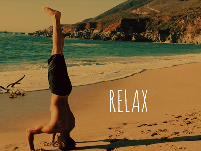
In the modern age of minimalistic design, color is essential to conveying your brand’s personality and creating a mood. Without it, flat and material design would look downright boring. You can use a solid color for your header image, a gradient, or an image with a color overlay. Either way, color instantly creates the desired mood – playful party spirit, relaxing mood or focused and professional mood.
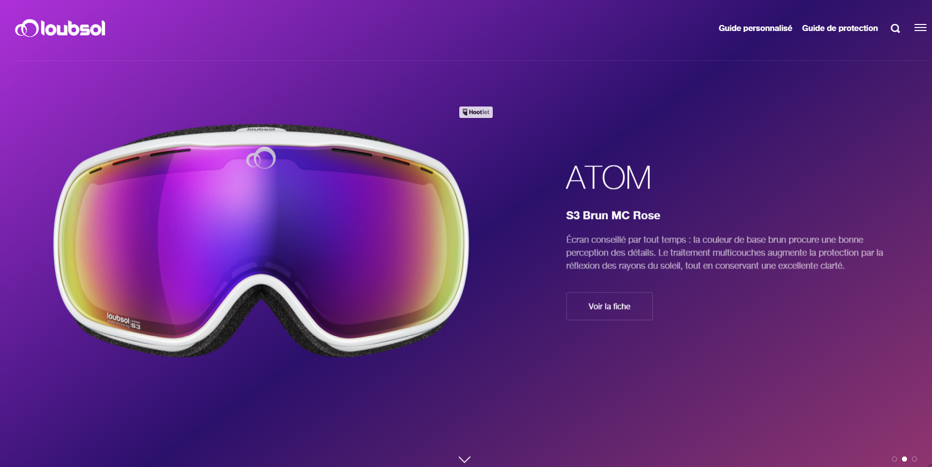
Use CSS gradient as a hero image. Source: Loubsol.
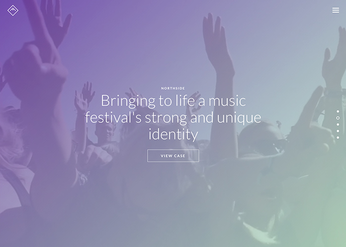
Use gradient overlay to create a mood. Source: Anders Hede portfolio.
Changing colors is a breeze with CSS Hero – just target the element, head to Background property, and watch colors change the look of your site in seconds.
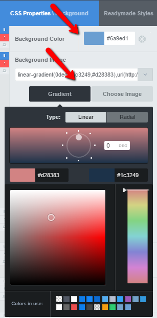
Change colors on your website with CSS Hero
Color picker and gradients interface in CSS Hero are very intuitive, but if you need more guidance and some cool ideas and shortcuts, check out our recent article on creating gradients with CSS Hero. Below, we’ll take a look at color overlays (the effect used in the second image above).
Finally, while you can go with an explosion of colors for the header image itself, exercise minimalism when it comes to the color of titles, navigation, and other text layered over the hero image. A neutral color will be your best choice.
Improve text readability
If you do decide to use an image for the hero header (and not a solid color or a gradient), start off with a visually attractive, well-composed, high-resolution photo. But your job doesn’t stop there. The image may look impressive by itself, but lose its power in the website environment where there are other elements in play. For example, text laid over an image can be very hard to read, especially if the picture is busy or detailed. However, since the hero header is the first thing people see when they visit your site, you really NEED this text to be legible. It will tell a story, engage your visitors or propel them to take action – learn more, see your portfolio, contact you or try your product.
With CSS Hero, you can darken the image with a color overlay to improve text readability. Besides, it’s a beautiful effect – and you don’t need Photoshop or coding knowledge to create it. Compare the two images below – doesn’t the text pop a lot better when there is a dark color laid over the background image?
Text over image background
Text readability is better with image overlay
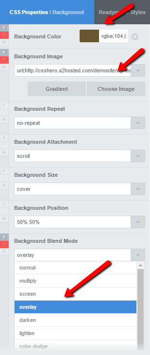
Here are the steps to adding an image overlay with CSS Hero:
- Target your hero header with CSS Hero
- Add a Background Image
- Pick a color (or a gradient)
- Set the Background Blend Mode to overlay
Add image overlay with CSS Hero
Go bold with typography
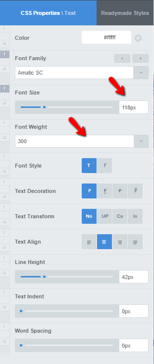
Give the title of your hero image some personality with handwritten typography or custom fonts, like in the example below. On the other hand, use simple fonts for navigation and subheads. The good thing is, CSS Hero enables you to swap fonts on your site easily. Check out this tutorial on adding custom fonts to your website and using them with CSS Hero.
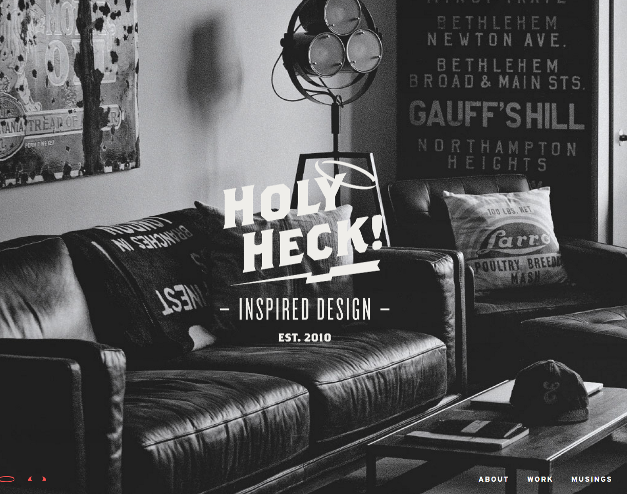
A big and bold title looks eye-catching against a hero image. Source: HeckHouse.
CSS Hero: Change fonts, decorate text and more
Add a subtle ghost button
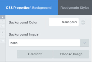
An effective hero image must strike a fine balance between aesthetics and functionality. Consider creating a ghost button for your hero header – it won’t hide the image, but will still motivate your visitors to take that next step. Of course, if your image has some unobstructed, light space to create a bright-colored button, go for it.
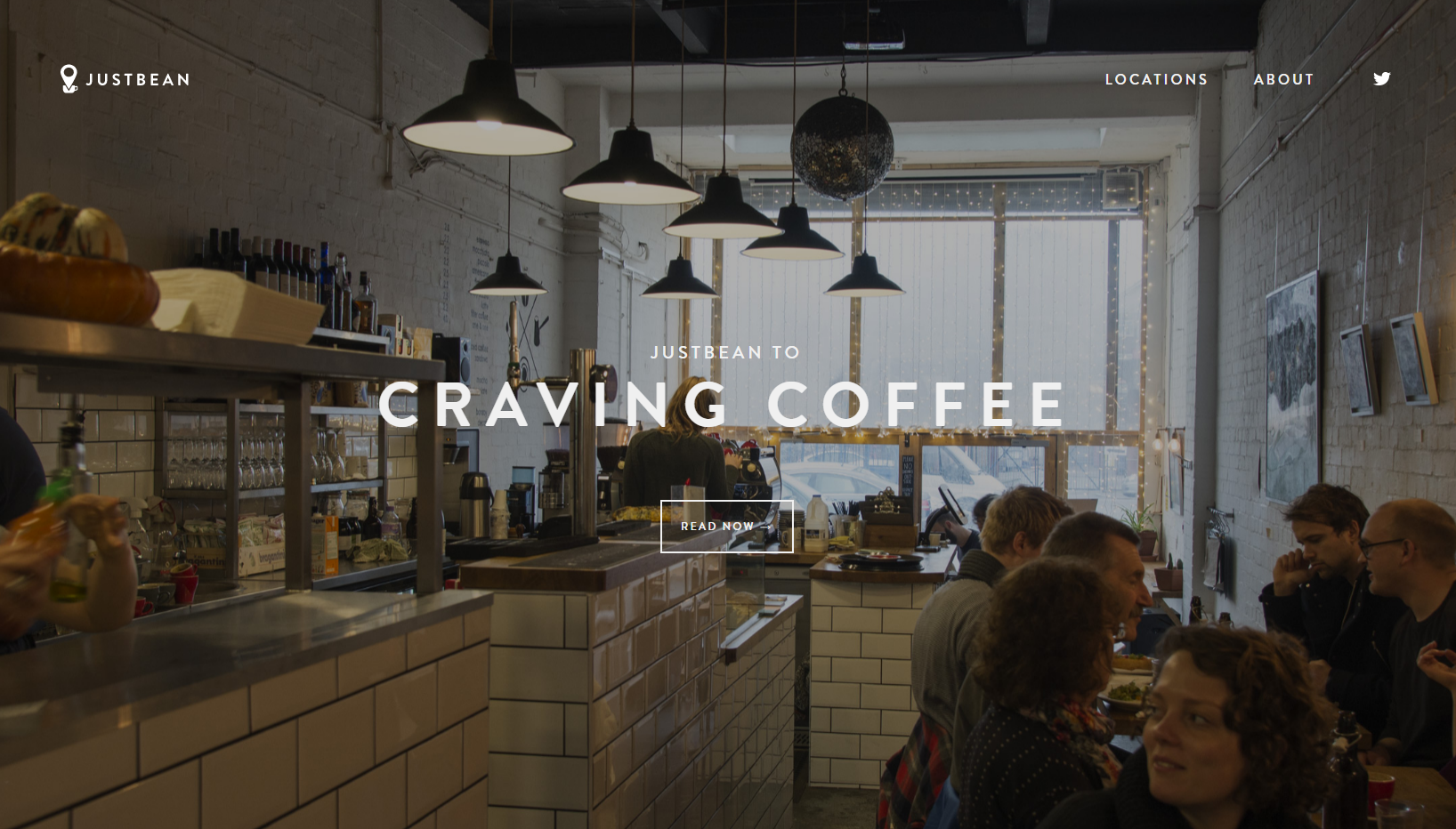
Ghost button on a hero image. Source: JustBean
To create a ghost button, set Background-color to transparent and then specify the border width, style, and color for the button. To make the ghost button fill with color on hover, edit its Background and Text properties with the Status Editor tool.
Create a ghost button with CSS Hero: Set background-color to transparent
Create a ghost button with CSS Hero: Style the border
Make hero image full-screen
If you want to go big and have your hero image take up the whole width AND height of the screen, viewport units will help you achieve this effect effortlessly (click on the link to learn more about this nifty way to specify size in CSS). Go to the Size property, and set the height to 100vh – and you are set with a full-page hero image, even if your theme doesn’t come with it.
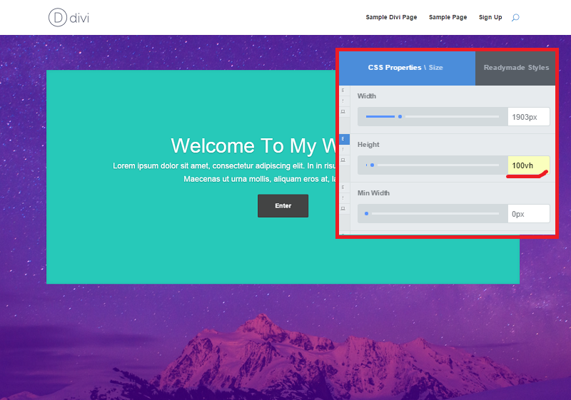
Set the height to 100vh to create a full-height image
Adjust positions of the elements
You don’t want the title, buttons or other elements covering vital parts of the hero image (and ruining the whole effect!) Use CSS Hero to adjust padding, margins, and text alignment to change elements’ positioning.
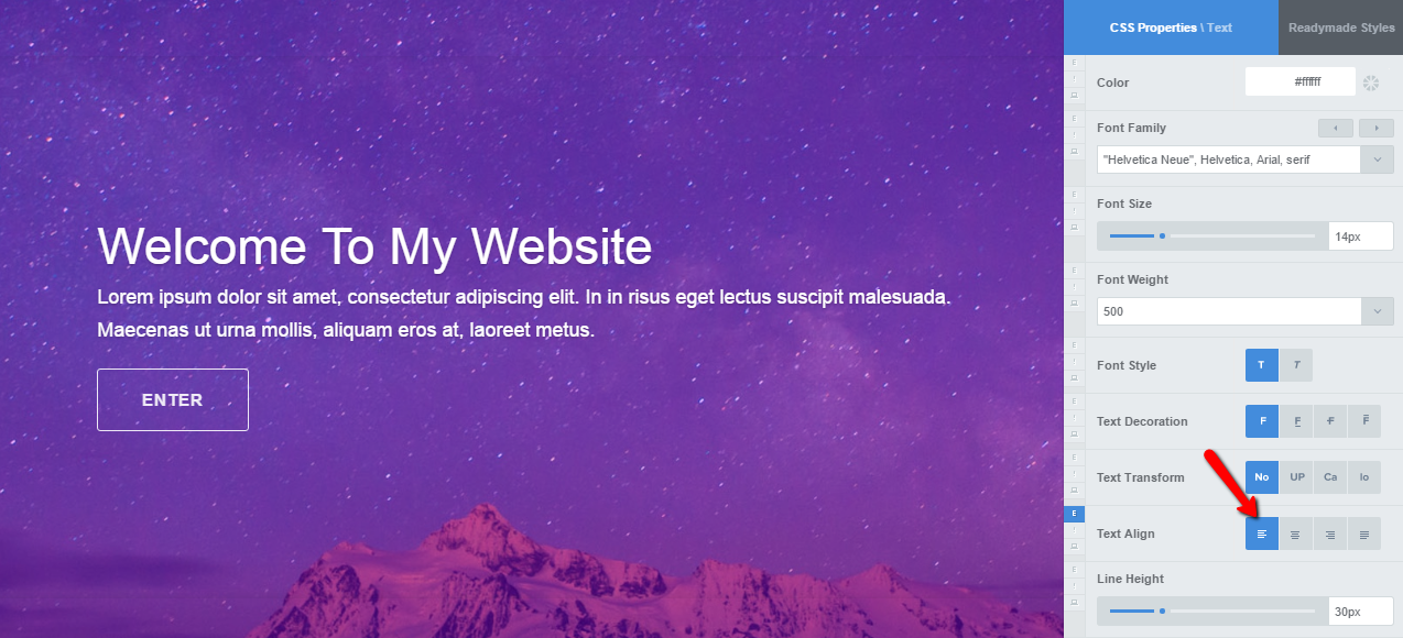
Change the position of the element by changing text alignment, for example.
However, be careful not to use absolute units with padding and margins, as that may break your page layout on mobile. Changing padding by 30 px makes only a slight difference when your site is displayed on desktop, but can ruin the design when displayed on a mobile device. Instead of pixels or points, try using relative CSS units, such as em, rem or viewport units.
Alternatively, use a nifty CSS Hero feature called Desktop Only switch. This way, you can keep your theme’s default settings for the mobile layout.
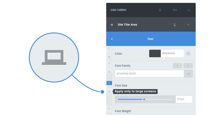
Applying an edit only on desktop mode
Make it look good no matter the device
Finally, you want your hero image to look stunning not only on desktop, but across devices. Use CSS Hero Responsive Editor to tweak how your hero header shows up on tablets and smartphones. You can save device-specific edits without them affecting the desktop version.
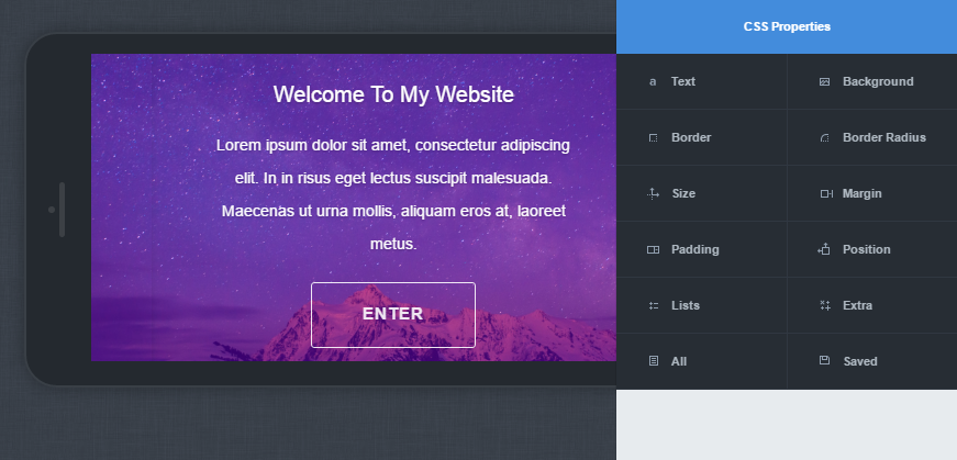
Use CSS Hero Responsive Editor to make sure header image looks good across devices
Do you use a hero image on your website? What are your favorite ways to make it wow-worthy? Share below.